Table of Contents
Date: 2013
The idea was to penetrate Japan mobile payments market, but that wasn’t an easy job to do. There was no straightforward way to connect to Japan’s MNOs and start selling digital goods. Instead, we had to build our wallet called ¥Coins to be able to do that.
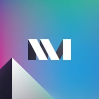
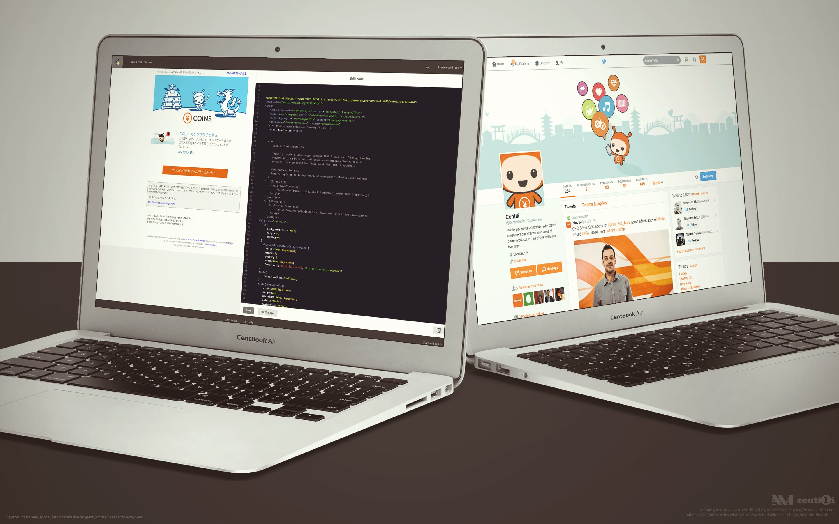
Awesomeness! °( ◕‿◕ )° Yenko on all this devices with those funky~urban patterns!
The ¥Coins is a virtual currency that enables paying for digital content in Japan. ¥Coins are tokens redeemed with real money that allow users to buy virtual goods over the internet. They can buy tokens via direct mobile billing, thus charging their mobile account.
Yenko Yenko Yenko °( ◕‿◕ )°
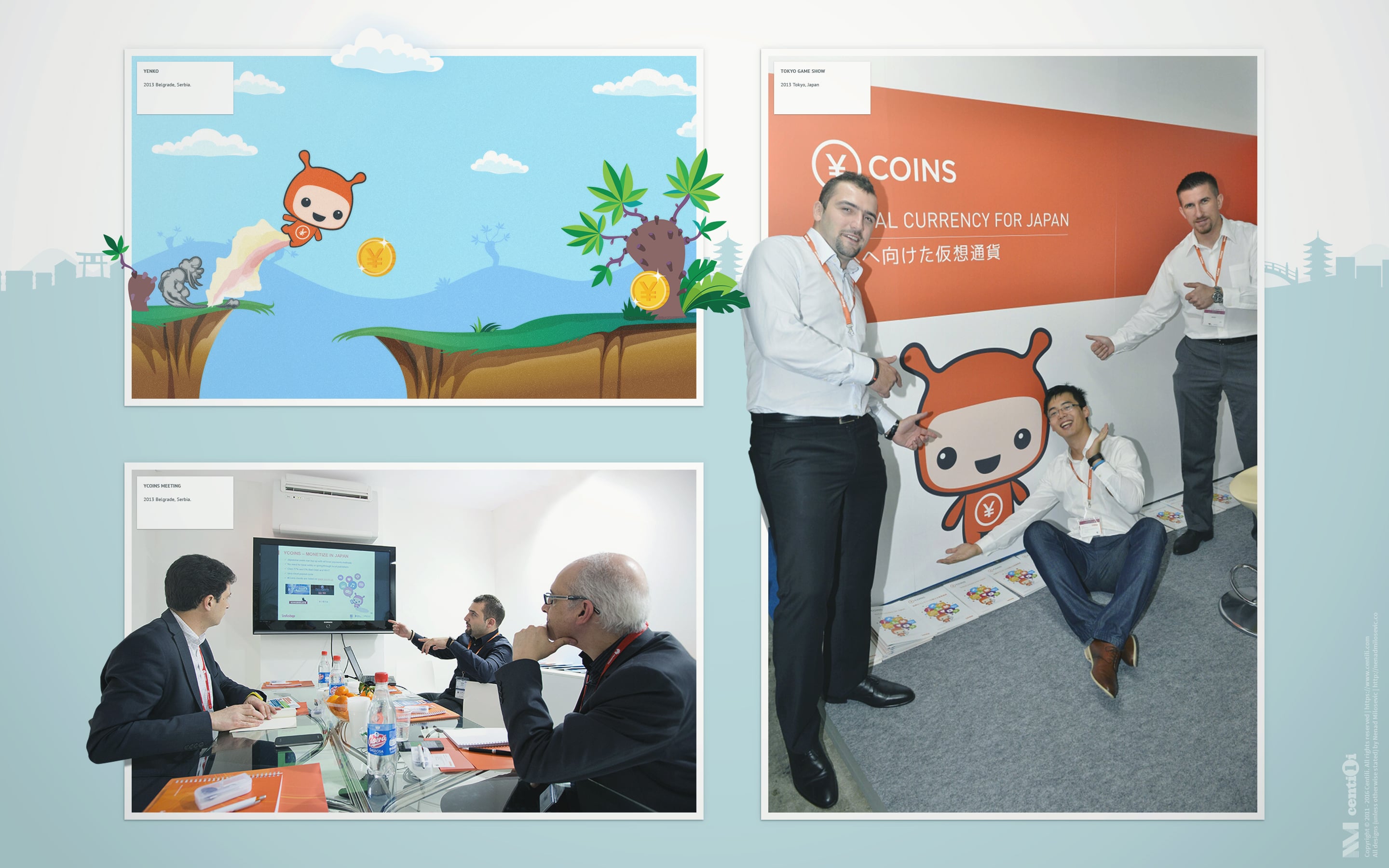
We collaborated closely with Japanese office on this project. After a dozen of meetings and long calls we concluded that we need a new brand for this wallet: ¥Coins that is!
Requirements were:
- Panel for user to refill the account and to check the balance.
- Payment Page adjustments for the new ¥Coins wallet.
- Multilingual website and blog.
- Email newsletter.
- Presence on social network.
- ¥Coins App Store for apps and games using ¥Coins.
⚜ ¥Coins logo & Yenko mascot
( ¥ ) in a circle for the ¥coins logo.
Stefan, from Infobip’s Design team, illustrated the Yenko mascot Japanese-style, and I designed the ¥Coins logo using Centili’s colors. Gotham typeface was the choice because we wanted a modern, minimal and memorable symbol. The logo and quite playful mascot combined worked well and looked professional. Everybody loved it straight away!
RoboYenko. [ ●ᴥ● ]
🔗 ¥Coins website & blog

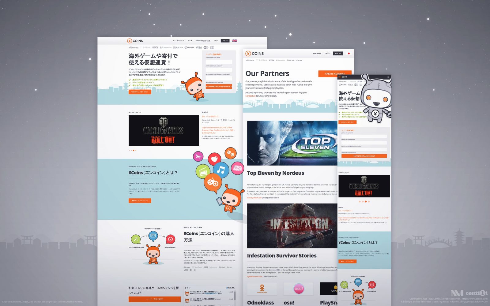
First drafts of ¥coins website and ¥coins panel.
After some restructuring in development teams, a new web designer Tovla and I, as lead product designer, were a new design team. Tight deadlines made us work under pressure, so original mockups were, to speak the truth, messy and shitty 💩 but we needed to start somewhere.

Second ¥Coins website designs
Our design team had support from parent company’s designers: Gotal helped us with designing the main website, and Stefan helped with drawing and illustrating the Yenko mascot. My role was generally more front end and UX oriented in this project. Tovla and I coded and implemented website and blog using the Bootstrap and WordPress.
I conducted research using StatCounter on IE usage and found out that users in Japan mainly browse the web with the Internet Explorer. 🤔

Statistics of IE usage in Japan.
By browsing and researching Japanese websites and talking to Japanese people about using the web, we learned about their preferences. Among the other things, what stood out the most was that they like to have as much information as possible on one page, and they love cute little mascots 🎎 and obviously prefer websites in Japanese language.
We tried to replicate Japanese-website-design style but ended up with cluttered and bloated pages. However by using patterns we know well, familiar design principles, and by balancing between styles, we managed to stay on the right track. Final designs were outstanding!

Final web design.
💻 Coding & optimizing
ℹ Here are the sample videos of desktop and mobile usability testing. 🔬
Besides testing with Peek, we tested our Panel, website, and blog with targeted users with a little help from our Japanese colleagues. Referring to the linked videos above, we were well aware that this site is not made and optimized for end users, but instead for our merchants and partners. We tested it against random users anyway, because we didn’t want to miss out on any possible ideas or suggestions on how to improve the site for everybody.
I took our design guidelines into account while designing and coding the ¥Coins blog. It was built on a WordPress using a Bootstrap as a foundation for the HTML and CSS. I tweaked a multilingual WP plugin, for my custom-built theme, to enable the support for other languages. I also suggested that we need web servers closer to our users, so we installed a blog on the server physically located in Japan to lower the latency. Even though we were planning to implement a CDN, we haven’t managed to do it while I was a product designer at Centili.

Blog design.
As for the website responsiveness, worth mentioning are those flying colorful icons which I made resolution dependent. The website displays fewer and fewer moving images as screen resolution goes smaller, leading to better performance by lighter CPU usage and better readability by more white space.
🔬 Testing the website
🤔 How would users react if they initially land on the blog instead of the homepage?
We tested it on random users too, and they were quite puzzled about how the damn thing works (as you can see in the linked video). However, we learned a great deal from those tests: what needs polishing, what’s clear, what’s not, what works and what doesn’t. I’m sad to say that we didn’t get the time to optimize the website for everyone because partners were our primary concern. So we adjusted the website to what interests our partners the most: features, references, benefits, selling points, etc. Next to our partners, we had customers who were our second most important group. They were interacting with website and panel on a daily basis. So, we focused and made their flows of topping-up and checking the balance as frictionless as possible.
Working on newsletter and social network designs.
📈 ¥Coins Panel
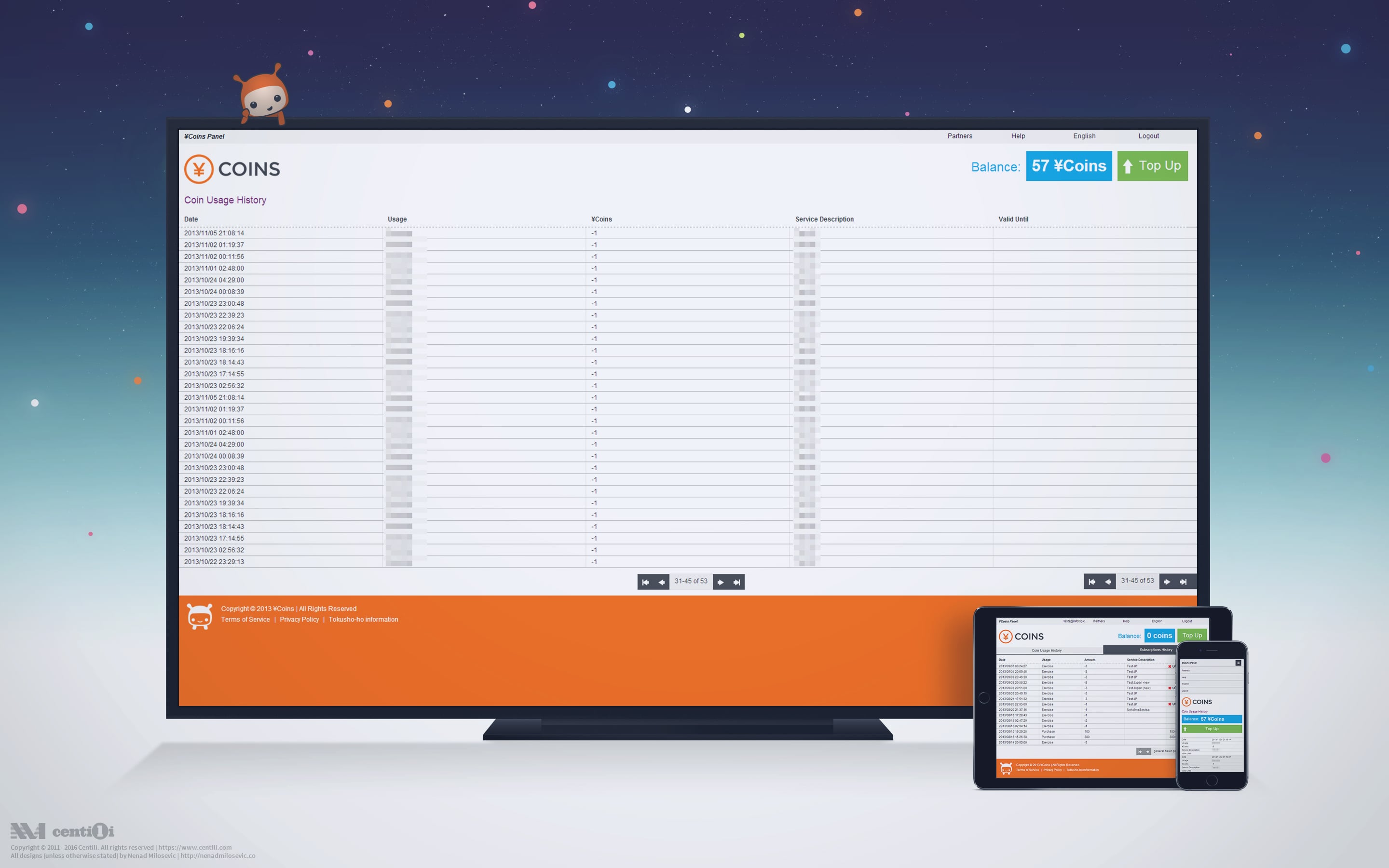
Yup, it’s fully responsive. ^^
Simple responsive tables that work over every screen resolution were one of the biggest interface/interaction design challenge for me at the time. I had a handful of ideas and a couple of solutions but eventually went with repetitive table headers. A variant that took a bit more of vertical space but it worked best in terms of functionality and clarity. If you want to learn more, don’t hesitate to contact me, I’d be glad to help.
🛍 ¥Coins Apps & Games store
Inspired by other app stores at the time, I came up with this beautiful ¥Coins Apps & Games designs. Everything crafted from the scratch following ¥Coins’s design guidelines.
")
My app store design. So sad this never saw the light of day. (╯︵╰,)
I created the logotype for the ¥Coins Apps & Games store. Unfortunately, company we partnered with on this project wasn’t able to implement my UI designs, so we were compelled to go with their generic solution. 😒
Apps & Games logo.
Nevertheless, we had success with the ¥Coins and the user feedback was that they had a great experience using it and had no major complaints. The product is there, alive, kicking 👊 and progressing slowly but surely!
If you want to read more about ¥Coins check this TechCrunch article.
⚠️ This page is part of a larger series of pages aimed at explaining the process of designing and developing mobile payment experiences. Learn more about “Mobile payments product design” here.
🚏 Next up → “Mobile payments: Payment page”.

Payment page
The initial version of the Payment Page had a ton of UI elements crammed and bloated on one single page, and It was like everything was competing for attention. There was no focus! I removed unnecessary buttons and fields first; then I took more a step-by-step approach…

Website
The old website was outdated, full of misleading information, loosely unorganized, out of style, and without a helpful CMS. At first, I tried proactively to create it on my own and succeeded to an extent…