
Table of Contents
Date: 2014
After few years, I realized that our Payment Page needed a full redesign. Just after Tovla left, I went researching and collecting info and ideas from a competition and similar industry products. Next, I compiled approximately ten questions for our partners, concerning Payment Page usability. I asked our support team to get in touch and forward my questionnaire. They did it and helped a great deal. With a ton of new interaction and visual design ideas collected, I had a bunch of fresh ways to improve the outdated Payment Page. Finally, I gathered all the ideas into one Jira task, opened internally for everyone to contribute constructive ideas, suggestions, inspiration, etc.

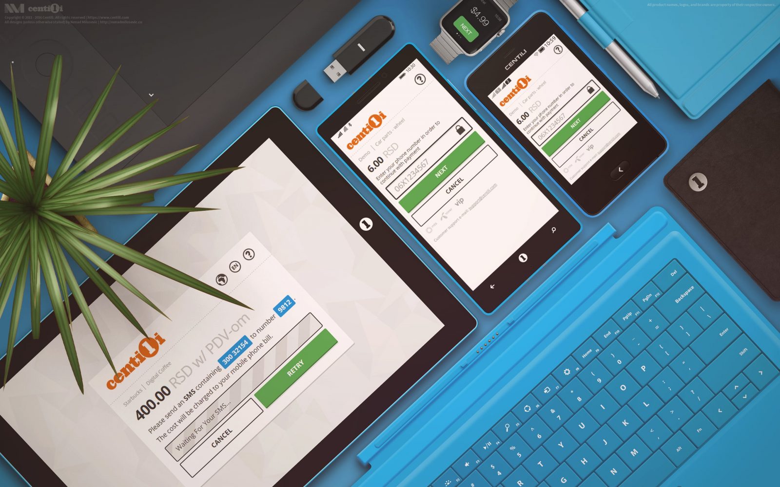
Final Payment Page designs.
“Perfection is achieved, not when there is nothing more to add, but when there is nothing left to take away.”―Antoine de Saint-Exupéry.
The initial version of the Payment Page had a ton of UI elements crammed and bloated on one single page, and It was like everything was competing for attention. There was no focus! I removed unnecessary buttons and fields first; then I took more step-by-step approach to focus the user on one thing at the time. I defragmented our old cluttered page into a couple of clean and focused ones by dividing user actions to single action per page; into step-by-step flow. The result was elegant, more minimal and cleaner UI which had a notable impact on decreasing the time required to complete the payment flow. This certainly meant a better user experience and more successful payments. Success!
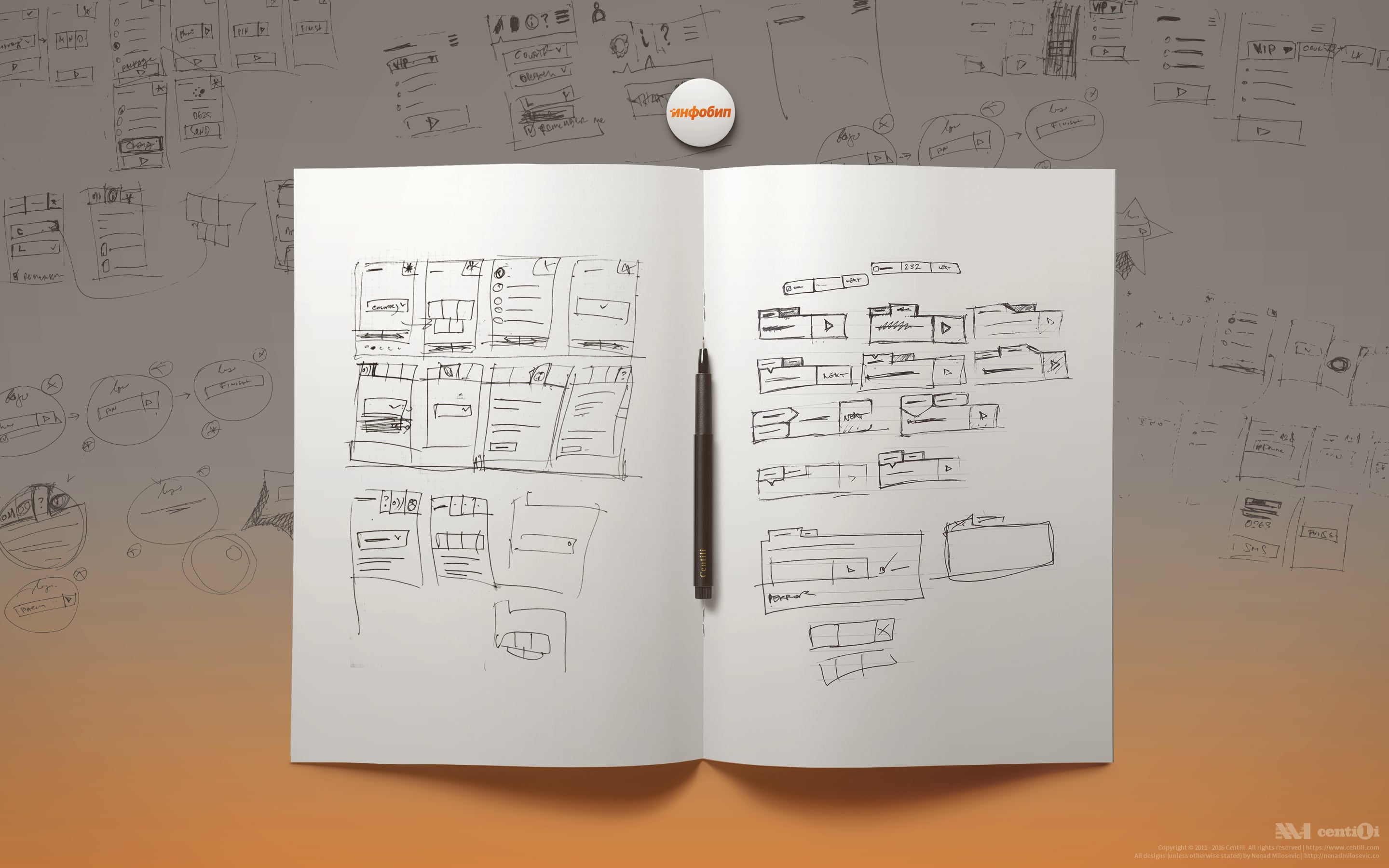
⚗ Developing Prototypes
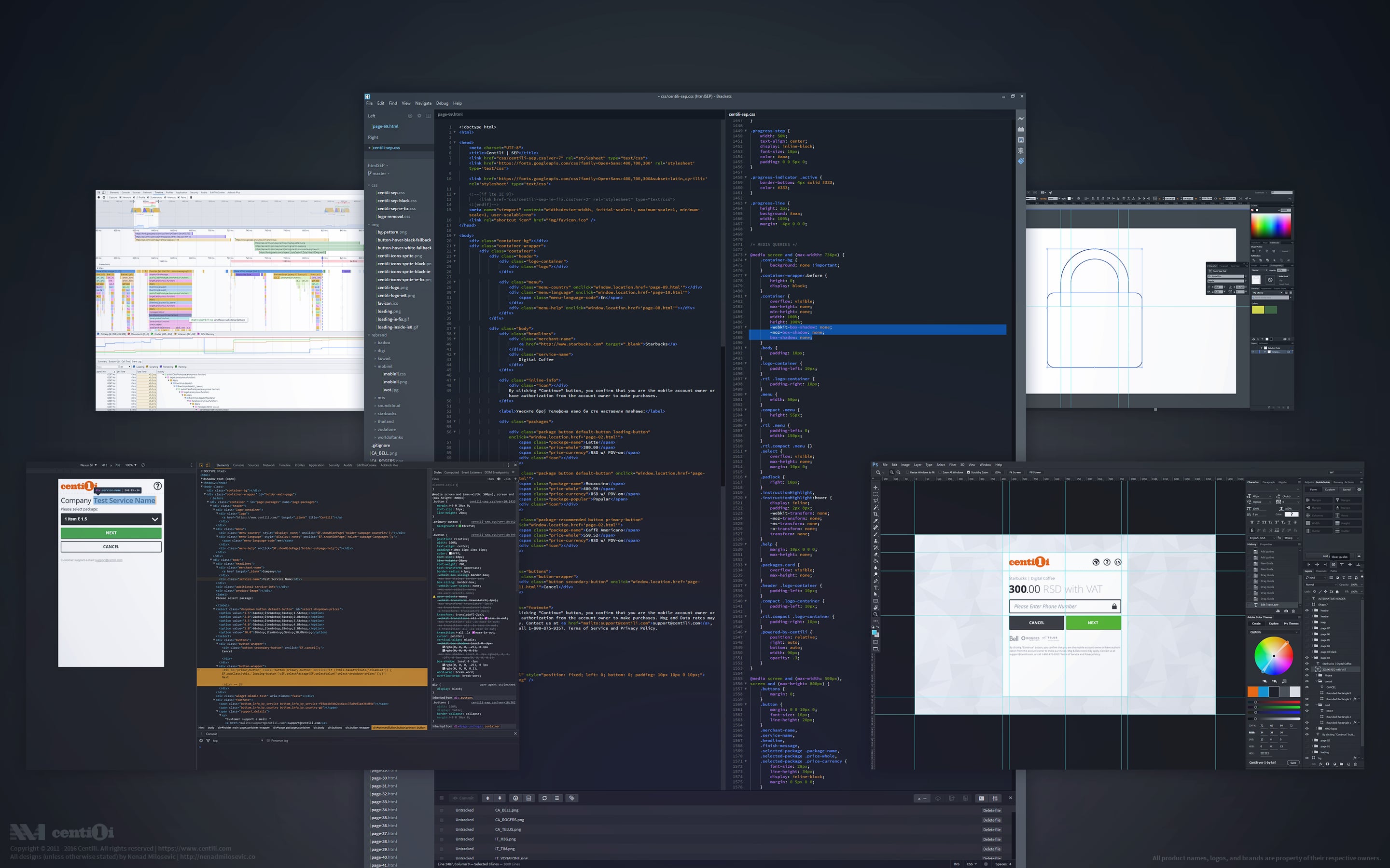
I went few times through the redesign process of sketching the ideas, making detailed wireframes, creating high-fidelity mockups, storyboards and flows, low and high level of rapid prototyping on paper and in HTML/CSS/JS, etc. Iterating, iterating, iterating…

Initial prototype
ℹ Here is the initial prototype live.

WinPhone prototypes.
ℹ Windows Phone-like theme. Prototype here.
This one was live for a short period till we made a version described below. And then again, with a new version, the process started with sketching on paper.

Moar sketches.
ℹ Half-finished but cool looking prototype of some WIP version.

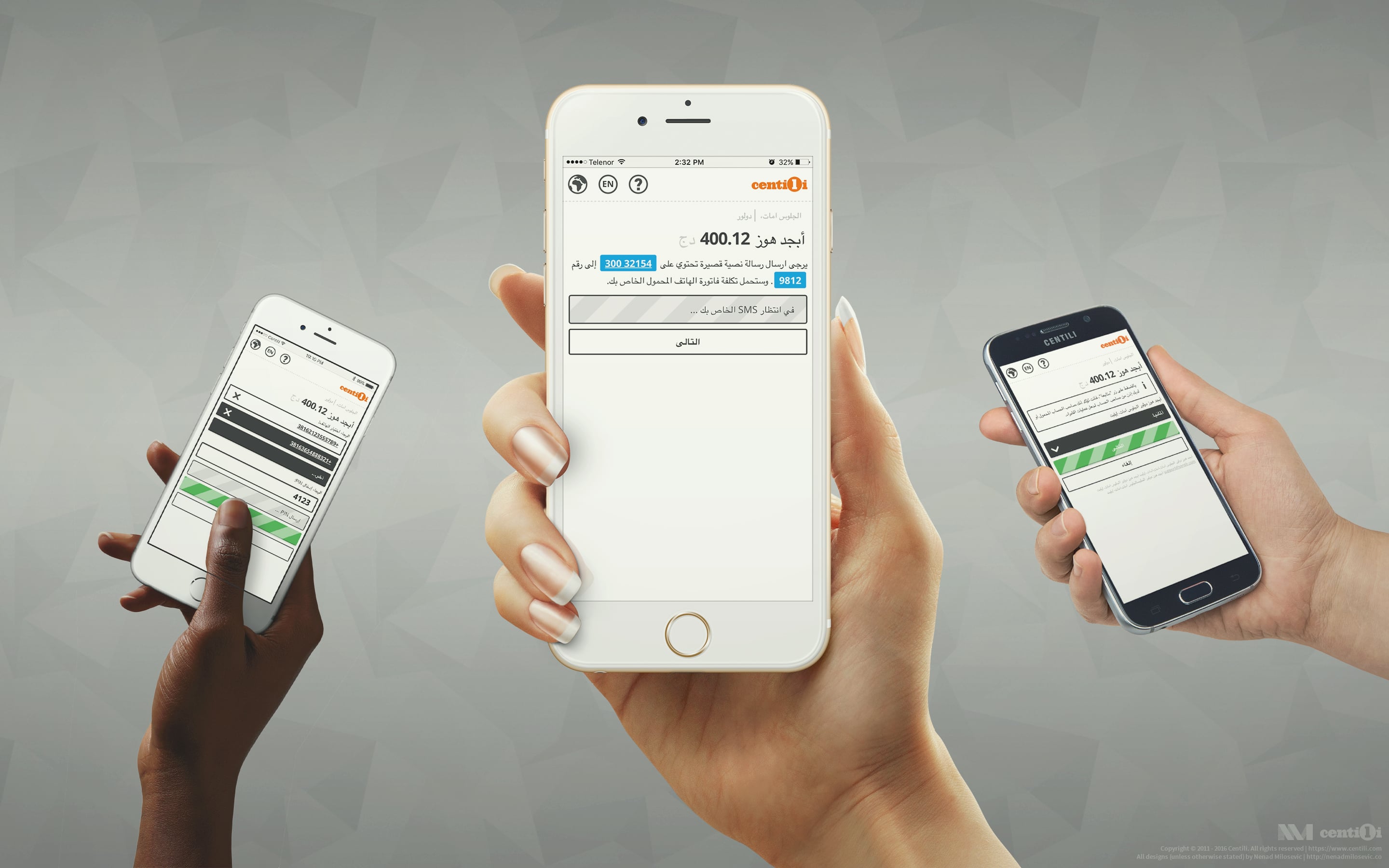
One of the cleanest user interface I designed for Payment page.
❇️ Single Entry Point
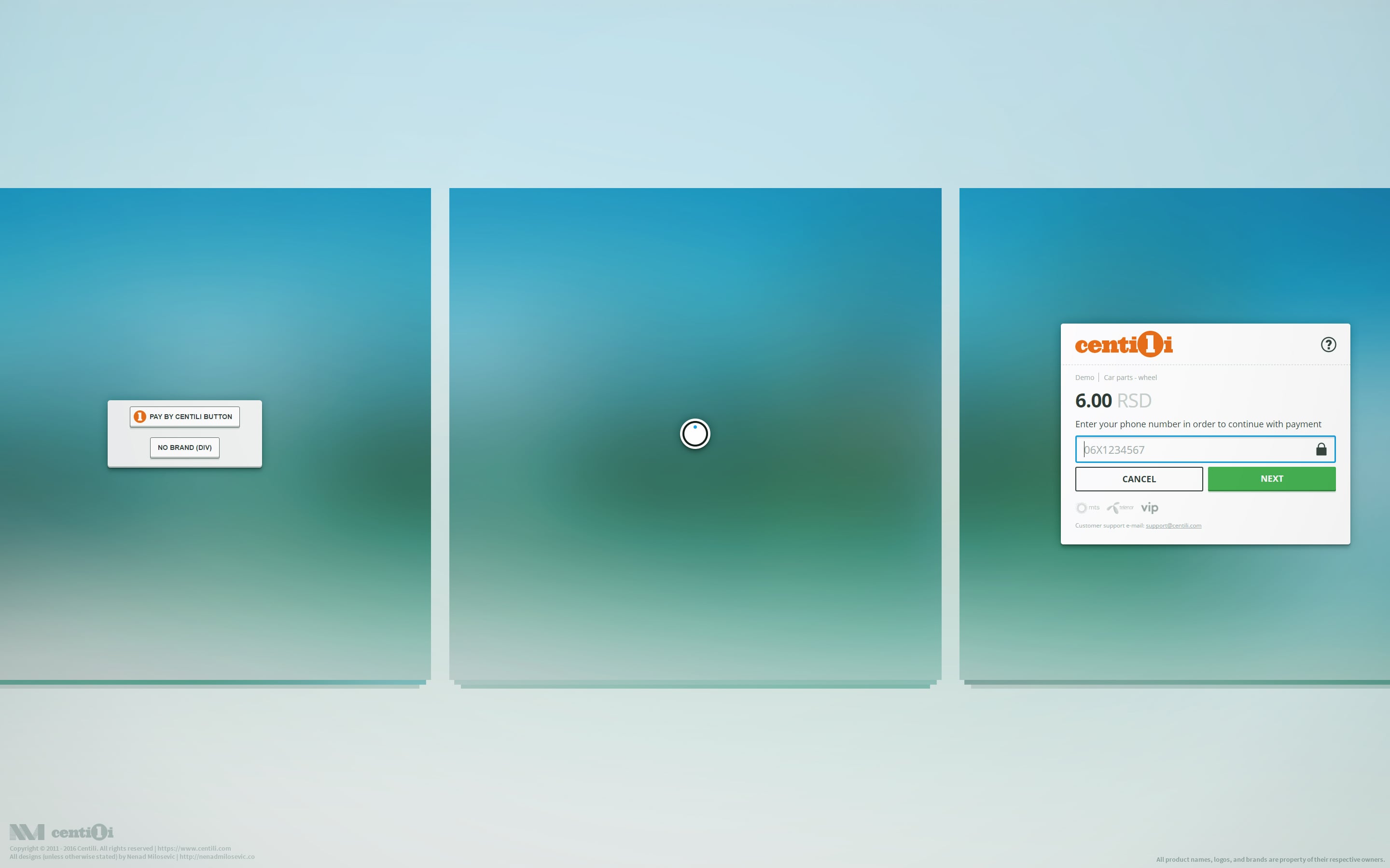
Final and currently live version of the Payment Page has code-named SEP (Single Entry Point). I designed it from the sketch and wrote the entire HTML and CSS code for it, too.
“Design is thinking made visual.”— Saul Bass
I enjoyed working closely with software engineers Aleksandar, Djordje and later Ivan on SEP Payment Page development. Users can access SEP from virtually anywhere: web, WAP, smartphone, feature phone. That made front end pretty interdependent. If you update one thing, e.g. for the mobile view, you must propagate that update across other supported devices and browsers.

“Any system that sees aesthetics as irrelevant, that separates the artist from the product, that fragments the work of the individual, or creates by committee, or makes mincemeat of the creative process will in the long run diminish not only the product but the maker as well.” —Paul Rand.
ℹ Take a look at the prototype and the live version or read more about it on Centili website.
🎚 Prototype benefits
My prototypes were crucial for building a well-designed product. They made us faster and our jobs much easier, on so many levels. For instance, when we had to present a new feature for the MNO review, we didn’t have to deploy the entire product to the production environment because we had my prototypes. We turned to them while helping our partners choose the UX/UI design that best fits their needs, and it was much easier to tell what works and what not while interacting with the prototype. I mentioned earlier how interdependent everything was, so in that respect prototypes further helped in testing new features and in fixing the bugs, too.
ℹ We made this demonstration SMS flow and PIN flow videos for the website.
Icons
- Compressed icons and images are combined into sprites.
- It’s fully responsive, even when it’s loaded or embedded in the iFrame.
- New buttons are made with pure CSS, easily customizable and compared to the old ones, not image-heavy.
📥 Payment page in context
Embedding Payment Page in modal window for conveying trust.
Djordje and I made SEP Payment Page able to be embedded in merchant’s page via the modal dialog, that way merchant’s brand is still present and effectively communicating trust to consumer. Similarly, Airbnb embeds third party Jumino’s page for ID verification into their page, opposite to opening it in a new tab.
ℹ Try embedded Payment Page here, live.
One notable Payment Page features is that it has only one CSS, independent of the access channel. If it’s used as Android Library, it will replace the font with a default OS font i.e. Roboto. If it’s viewed on tiny resolution featured phone, it will automagically transform and collapse the UI and adapt to the screen size with no problem.
🔔 Payment Page UI
Some of the tools I use for web development, user interaction and user interface design.
In mobile payments it’s very important that everything is super user-friendly and within ethical, white-hat patterns! Here is the list of main interface and interaction features/principales I made sure were applied:
- Branding elements, such as logo, a name of the company, and service, are in the upper left corner of the header.
- Always accessible help, country, and language controls in upper right corner.
- Clearly highlighted price with currency, VAT, and other info.
- Easy to understand, familiar and accustomed icons.
- At the bottom, easily accessible buttons with large clickable/tappable area.
- Buttons are positioned and arranged by priority, e.g. action buttons are consistently on the far right side.
- MNO logos are present to convey trust and to inform what networks are supported.
- Meaningful, functional and snappy animations.
- Support contact, warnings about additional charging, and other additional information is located in the footer.
- Hierarchically arranged elements.
- Detailed instructions and descriptive labels, localized. Supported languages: العربية, Български, Bosanski, Crnogorski, Česky, Dansk, Deutsch, Ελληνικά, English, Español, Eesti, Suomi, Français, Hrvatski, Magyar, Bahasa Indonesia, Italiano, 한국어, 日本語, Lietuvių, Latviešu, Македонски, 普通话, Bahasa Melayu, Norsk, Nederlands, Polski, Português, Русский, Serbian Latin, Slovenščina, Slovenčina, Shqip, Српски, Svenska, ไทย, Türkçe, Traditional Chinese, Українська, Tiếng Việt, 中文 (Zhōngwén).
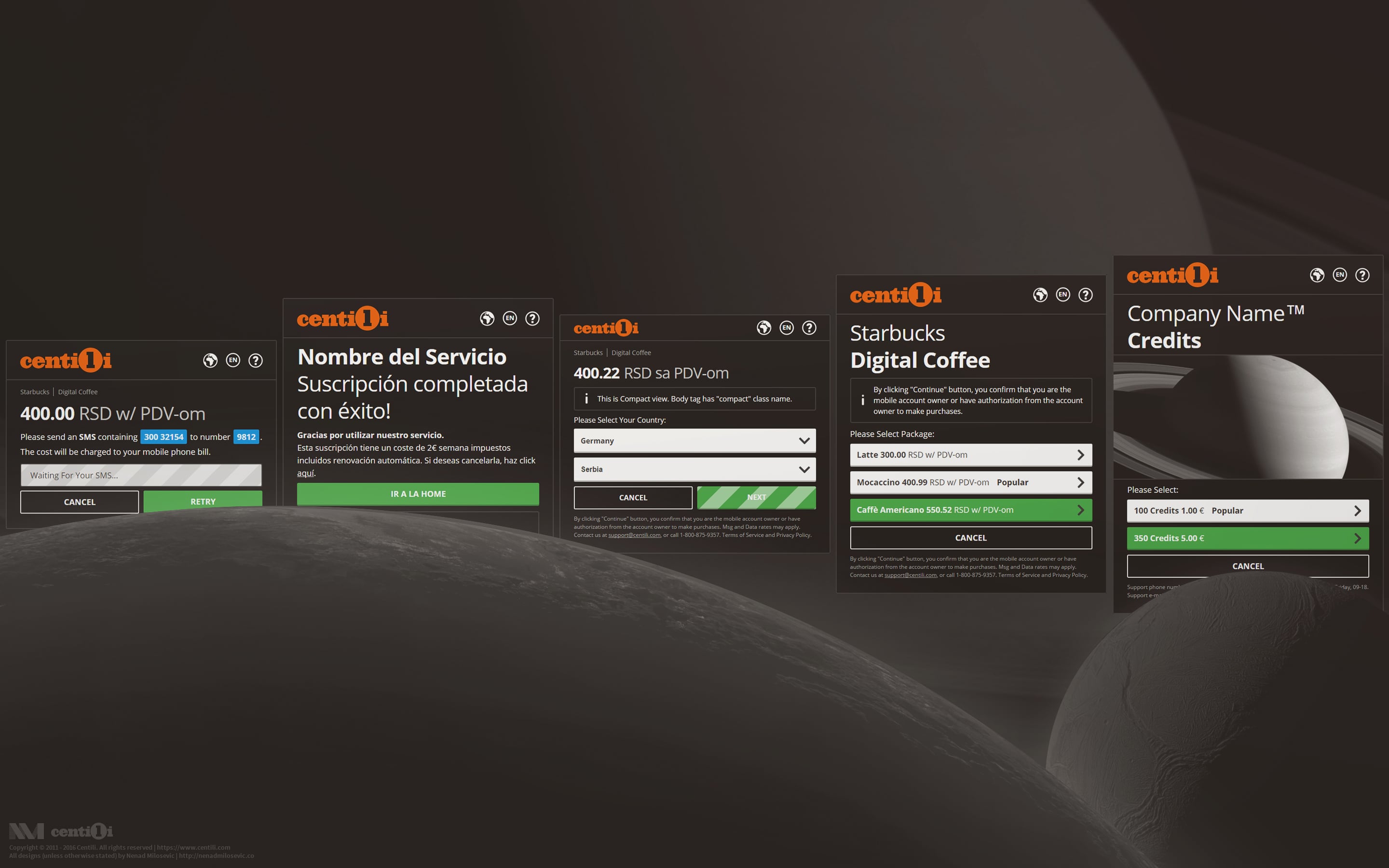
- Readability. Text instructions contain a short code which user needs to send via SMS to a specified phone number. The code and the number are visually encapsulated into separate inline-blocks that don’t wrap the white-space, so they don’t break into two rows, making it harder for a user to misread them. Here’s the CSS you need to make it so:
.no-wrap { white-space: nowrap; display: inline-block; } - The elements are color coded. Action buttons are green, info elements blue, neutral elements gray, warnings and errors red.
- Each page is focused on a single action, so less cognitive load needed from the user.
- Smart defaults. For example, users location, located by MaxMind’s GeoIP service, is used for pre-selecting the language and currency. Another example is pre-selection of the package with the highest price. Smart defaults make it much easier for the user to navigate through the flow and complete the task faster.
- Placeholders. For example, a phone input has a placeholder number in MSISDN format to help users grasp that field just by glancing at it. To enhance the UX even more, both phone numbers entered with and without country code are accepted.
- Loading indicators are present on different levels: main loading bar, button loading animations, and several status indicators. All of this to help better communicate to the user the system status.
- Help window with basic instructions and additional support contact details is accessible from the header.
- The 18 certificate sign 🔞 is present in case that content is only suitable for adults.
- Padlock icon 🔒 is shown to build trust and to reassure that payment transfer is secured (by the SHA-2 certificate).
- No active nor passive mixed content. Requests are served over HTTPS.
- Support for major browsers, IE8+.
- 80KB for web and 50KB for Payment Library file size.
🔄 Right to the left, left to the right!
˙ʇɟǝן oʇ ʇɥbıɹ
A variety of languages, particularly RTL writing systems demanded a flexible design. RTL isn’t just about a text going from the right to the left, it’s like everything is mirrored. Scrollbars are on the left side, icons are on the right, but on the contrary, there’s a convention that numbers are written from left to right. For obvious reasons. You don’t want people confused about the price, is it 58 or is it 85!? 🙃 The breaking of the words in a sentence is different and even selecting text is unusual―multidirectional. Try selecting this to see what I mean ➡ عدد 123456789 اختبار. 😮
🛠 Customize-o-rama
Beautiful black theme.
Like the older version of Payment Page, this one supports customizations, but with deliberately limited number of options. Pretty much closed system. I wanted to preserve original product experience as much as I could because some merchants tend to over customize things. Besides default white theme, merchants could choose the black one.

Payment Page rebranded as Starbucks.
We were well aware that rebranding helps conversions, so we enabled our merchants to change and adapt the visual design to their needs, but within our guidelines. We support adjustments of background, logo, product image, banner image, primary button color, etc. For greater control, there is a Payment API.

Wargames World of Tanks and Badoo white labeled in line with our design guidelines.
Our Payment Page supports customizations on country, MNO, reseller and merchant level. Each level is dependent on the parent level, for example, changes made on one level are propagated to all descendent levels.

How I customized designs to Italian’s country regulations.
📄 Documentation

Documentation in Confluence.
I documented the rebranding process so that other teams can easily rebrand it without my supervision.
🗜 Product designer’s tools & utilities

Some of the tools I use for analytics, design testing, code validation etc.
It was crucial that our product works smoothly over a variety of devices, operating systems, browsers, screen resolutions, languages, and cultures. For example, when your clients are international, you need to double-check if particular color, word, or symbol really means what you believe it means. And don’t forget: test as much as you can.
Here are some of the useful tools I used on our front end:
- Google Analytics
- BrowserStack
- WebPageTest
- PageSpeed
- Pingdom
- YSlow
- Nibbler
- Peek
- UserBrain
- W3 Validator
- Kraken
- Compressor
- TinyPng
- Cdnjs
- RequestBin
- Can I Use
- HTML5 Please
- Chrome DevTools
- MDN
- Web Fundamentals
💕 Forms of flattery
People could be inspired by your work, but people could also straight up steal your shit. Unfortunately, it happened to me many times before, but fortunately, over time I have learned how to handle it and stay cool:
“Imitation is the sincerest form of flattery.”―Charles Caleb Colton.

Please tell me, can you spot the difference?
🙌 Bottom line
To summarize, we succeeded in making the Centili a better product. With more returning users and less time spent in process of paying and more time spent enjoying the content, Payment Page is a success. Feedback from our users, partners and resellers is way better now, and the partners have fewer or close to none requirements anymore. Most importantly the revenue is steadily going up. I’m so happy how everything turned out at the end. 🎉
⚠️ This page is part of a larger series of pages aimed at explaining the process of designing and developing mobile payment experiences. Learn more about “Mobile payments product design” here.
🚏 Next up → “Mobile payments: Website”.

Website
The old website was outdated, full of misleading information, loosely unorganized, out of style, and without a helpful CMS. At first, I tried proactively to create it on my own and succeeded to an extent…

Retrospective
We took great care of our consumers, clients and partners, and put lots of effort to meet their needs. We fixed the bugs and met the feature requests in no time, but we remained focused and in control.