Table of Contents
Date: 2011
Back in 2011, I moved to the capital city to work at Centili where I was the product designer for five years. Centili is a B2B and B2C mobile payment solution company focused on micropayments 💸.
I was so pumped by being a part of a team working on cutting edge technology and solving challenging problems. I was so lucky to be there from the beginning, before the original idea was even born.
Back then, direct carrier billing, premium SMS, and mobile web payments (WAP) were rather a new thing. There weren’t many competitors, and existing software solutions weren’t designed that well. With a complete lack of style, from a decade ago, and desktop-only UI; it felt like those products weren’t designed at all. Our parent company was already in the mobile telecommunications business, so we had a lot of efficient mobile network operators’ connections. The fact is, to succeed in the mobile payments business, the number one priority is direct MNO connections. Nevertheless, we had no experience with mobile payments whatsoever.
We needed to build everything from scratch. A product tailored to the needs of our users and clients required every single aspect of our software to be in line with our mission. We envisioned an effortless and secure payment experience for our users without which we knew we couldn’t attract clients.
🔀 2-Way elevator pitch
On the one hand, we’re helping online merchants open new revenue streams with mobile payments so they can monetize effectively. On the other hand, we enable end users to pay for digital goods and services by mobile phone without the need of a credit card, PayPal or unnecessary registration. Purchases are directly charged to their phone bill instead.
👥 Who are our end users
One classic example of mobile payment user flow would be something like this:
- The user taps on the ‘show premium content’ button.
- Our Payment Page opens up, prompting for the cell phone number.
- The user enters his or her number.
- We send an SMS with a PIN to his or her phone number.
- The user enters the PIN back to our Payment Page for verification.
- If the PIN is valid, we charge the user’s phone bill.
- And that’s it, a successful transaction! The user now has access to the content. 💎
We did research on the end users and created a few personas to better understand what we needed to build. We concluded that these are the most common user end goals:
- Pay premium content in a game.
- Buy digital goods on the web.
- Pay for a subscription.
- Pay for exclusive downloads.
- Buy account updates on social networks.
Google Analytics and feedback that we collected helped us identify our end users as:
- Young and middle-aged people.
- Both genders, slightly male predominant.
- Located internationally, currently in 80 countries .
- Multilingual.
- Originating from various cultural backgrounds.
- Using different devices, OSes, and variety of screen sizes.
⚒ The team & my product designer role
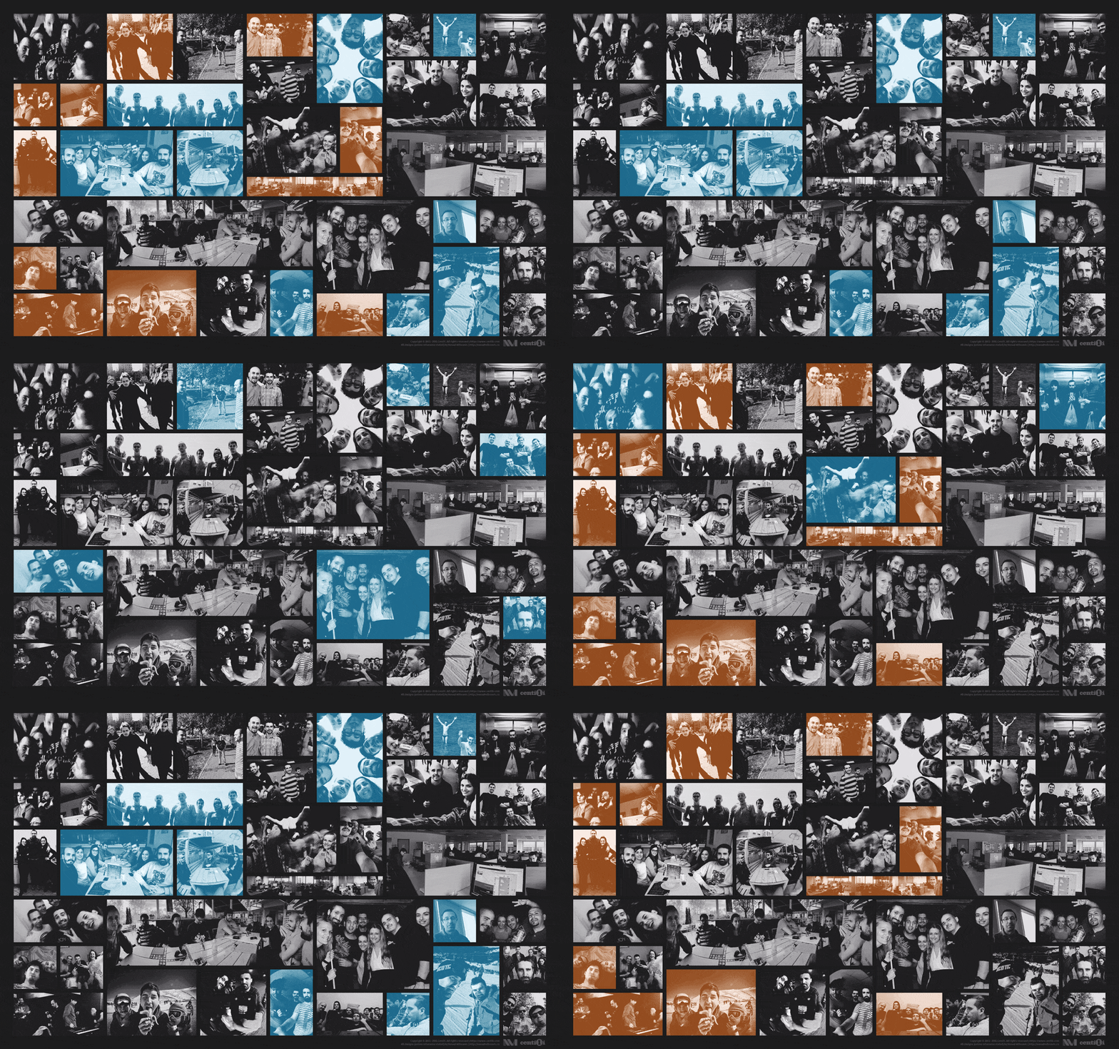
I have met hundreds of great guys & gals at Centili, hope I haven’t forgotten to mention someone. (・_・;) P.S. Click / tap the image, it’s animated! ^.^
Even though the company was sizable, I wore many hats. I was the lead digital product designer, user experience designer, interaction designer, user interface designer, application designer, visual designer, identity designer, motion designer, and at times front-end developer. Luckily, I already had developed the broad set of technical skills needed to do so. One-man design team! 🦄
I worked closely, and often in teams, with other designers and front-end developers, on our in-house projects. I collaborated with my co-workers from marketing, integration, and networking teams, internally and externally.
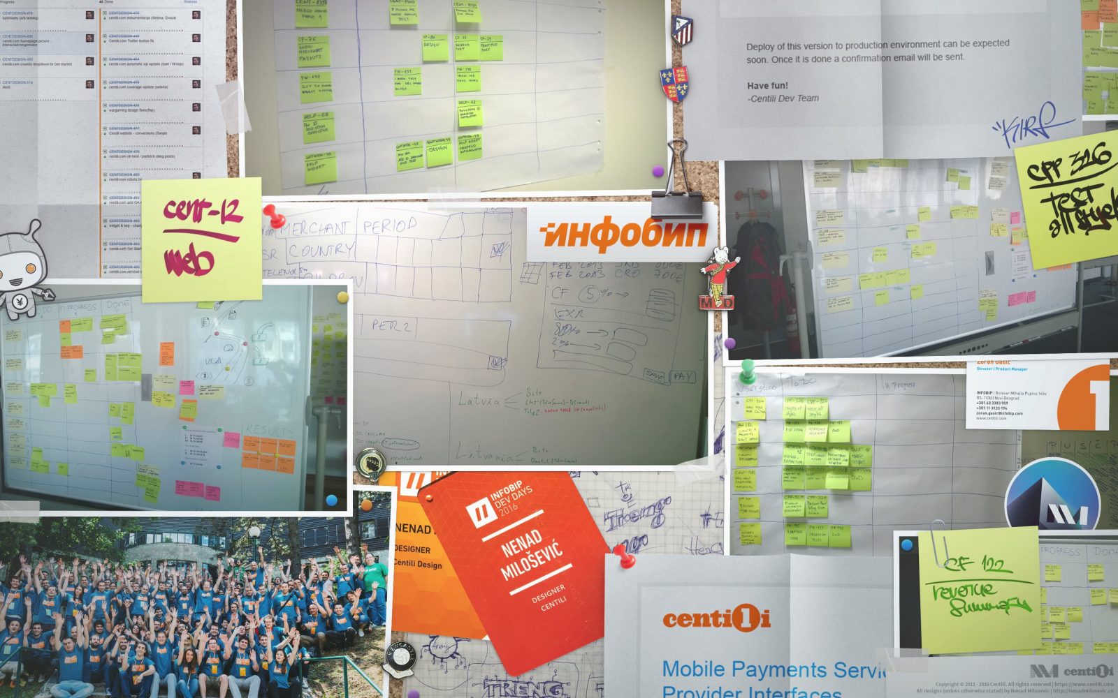
Generally, we practiced Scrum for agilely managing product development but, near the end, I used the Kanban scheduling system instead.
⚠️ This page is part of a larger series of pages aimed at explaining the process of designing and developing mobile payment experiences. Learn more about “Mobile payments product design” here.
🚏 Next up → “Mobile payments: Old payment page”.
Old payment page
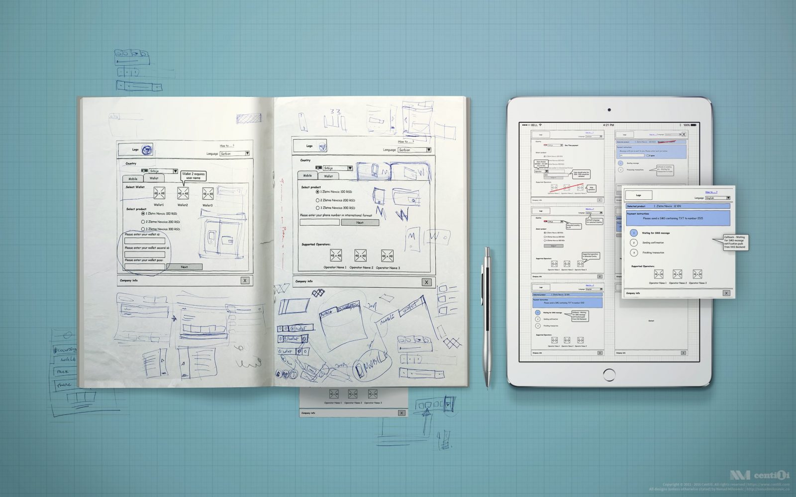
In collaboration throughout the design process, I draw on a whiteboard, sketched on paper, made blueprints in Pencil, created mockups and storyboards in Photoshop, and produced HTML/CSS/JS hi-fi prototypes.
Admin panels
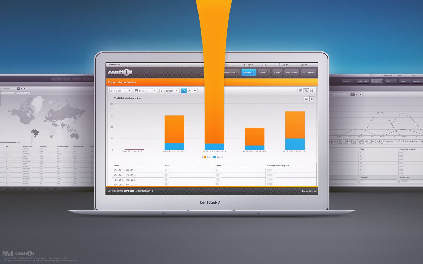
The Partner Panel is an administration application for merchants, mainly for creating and configuring the Services. Set of configurations assigned to one payment is called Service.
