
Table of Contents
Date: 2011
The company’s early idea was to create the technology for topping up mobile phone accounts internationally. My job interview exercise was to design a UI mockup for that front end. Unluckily, the idea failed. Luckily, we ended up recycling my designs as a starting point for our new mobile payment product idea. 👍
")
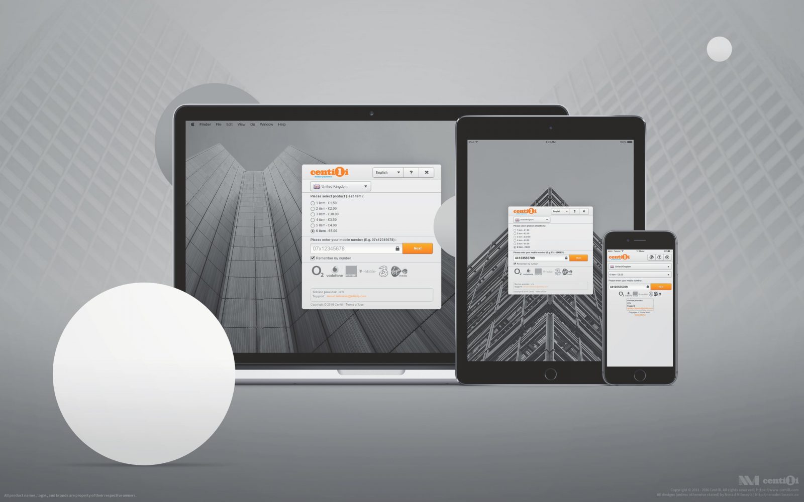
My first Payment Page responsive design from 2011. ( ˘⌣˘)
I was on a mission with my partners in crime, the software engineers Pedja and Raf, to solve user problems and craft the front end for the first version of the Payment Page. Working together with cross-functional development teams and later others was, to say at least, outstanding and inspirational.
")
These guys: we were the ones who started it all. : )
⚜ Centili logotype
“Work? It’s just serious play.”—Saul Bass
I was put in charge of the marketing department as well. My responsibilities then escalated to information architecture, copywriting, and research; thus, as the only designer at the time, I had to prioritize and focus hard.
This is the final logo design I did in 2011. It’s still in use today.
I brainstormed and sketched ideas first. Then I drew till I found a memorable and compelling mark, a symbol that would go well with our vision and the parent company’s values.
Logo, color, typography, and image guidelines.
ℹ If you’re into trademarks, be sure to check out Logo Modernism for some quality corporate identity inspiration from the 40’s to the 60’s. You’ll be surprised by how many of today’s logos are straight-up stolen. 🕵
💦 How we did it
In collaboration throughout the design process, I draw on a whiteboard, sketched on paper, made blueprints in Pencil, created mockups and storyboards in Photoshop, and produced HTML/CSS/JS lo-fi and hi-fi prototypes. When we were on the same page, developers started building custom components for the Payment Page in Java using GWT framework which was quite popular at the time.
“Practice safe design: Use a concept.”―Petrula Vrontikis.

Tons and tons of my concept sketches and other doodles.
Starting out with little in terms of user-data, statistics, analytics, we began building. We needed to move fast but now I wish we had conducted more research―it would have helped us a lot down the road.

My concepts, wireframes, drafts, sketches, drawings.
I redesigned that UI from my interview exercise a couple of times down the road.
 Package selection 2) SMS instructions 3) Transaction result.")
User flow: 1) Package selection 2) SMS instructions 3) Transaction result.
🔧 Front end optimizations
Beside server side optimizations as gzipping, caching, redirection, etc; we were applying these techniques to make a Payment Page load faster and to be more responsive: ⚡
- Prefetch and prerender resources.
- Minify and merge JavaScript and CSS files.
- Use SVG and CSS instead of bitmap images.
- Compress bitmap and vector images.
- Merge images into sprites.
- Inline CSS and JavaScript in HTML.
- Defer and async JavaScript.
- Use CDN-hosted libraries.
- Use CDN-hosted web fonts.
- Prioritize resources loading.
Icon sprites used on the first version of Payment Page.
I used Kraken, TinyPng, and Compressor to compress the images and Photoshop to create a set of images merged into one big image i.e. sprites. To make web pages load faster, I aimed for lighter file size and fewer server requests.
👷 Payment page integration
An easy integration of Payment Page involved just two simple steps:
- To include the script to reference a JavaScript file in a head element of a web page.
- To add the button for launching the Payment Page with appropriate ‘id’ and ‘href’ attribute.
We wanted a simple but identifiable payment button, something similar to famous PayPal button.
- Visible―contrast and color should work against different backgrounds.
- Recognizable―Centili branded.
- Understandable―to be readable, localized, and to look like a button.
- Effortless―with big enough clickable area for easy interactions.
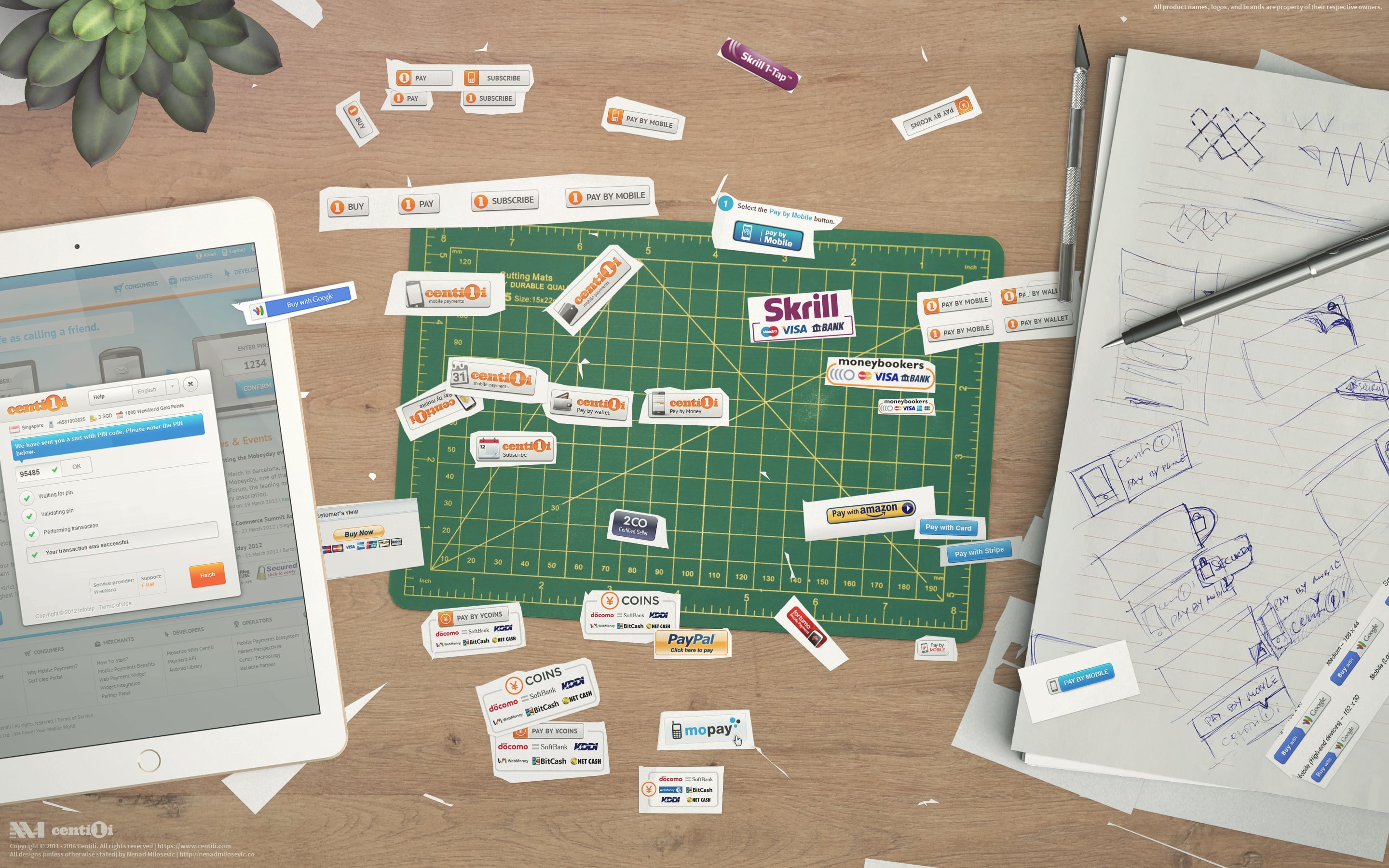
Operation: Buttons! Sucking the inspiration from the wild.
I have tried a variety of button designs against the competition and searched for inspiration from button designs of companies in similar industries.
📱 Payment library―more than a web page
The Payment Page was responsive and accessible from the web via desktop or mobile, and additionally, for Android apps through the Payment Library.

First Android payment library design I created.
I created bitmap assets for multiple screen sizes and densities. Must-have at that time were ldpi, mdpi, hdpi, and xhdpi. For the resizable elements, 9-patch technique helped me construct resolution-independent assets.
✍ Right to left writing system

Right to left optimizations I did for mobile and desktop.
Full localization required support for RTL writing system and fonts that could render all characters correctly.
🏷 Rebranding & customization
As PayPal has Custom Payment Pages, we had product customization. Right from the beginning clients demanded a feature to customize the designs, primarily to their style, brand, look and feel. It was necessity and clearly a big selling point. We built various options for rebranding the Payment Page, and the best thing about it was that our competition didn’t have any of it.
The rebranding procedure went something like this:
- The client sends us their requests.
- Following their design guidelines, I redesign our Payment Page.
- If tests are passed, we’re ready to go live and to ship! 📦

My mockups and final designs for World of Tanks rebranding of the Payment page.
Top-priority for the mobile payments business are direct MNO connections. That brings us to operators and their requirements. With more than 250 operator connections, the variety of demands coming my way was astonishing―from simple copy revisions to the full-on redesigns.
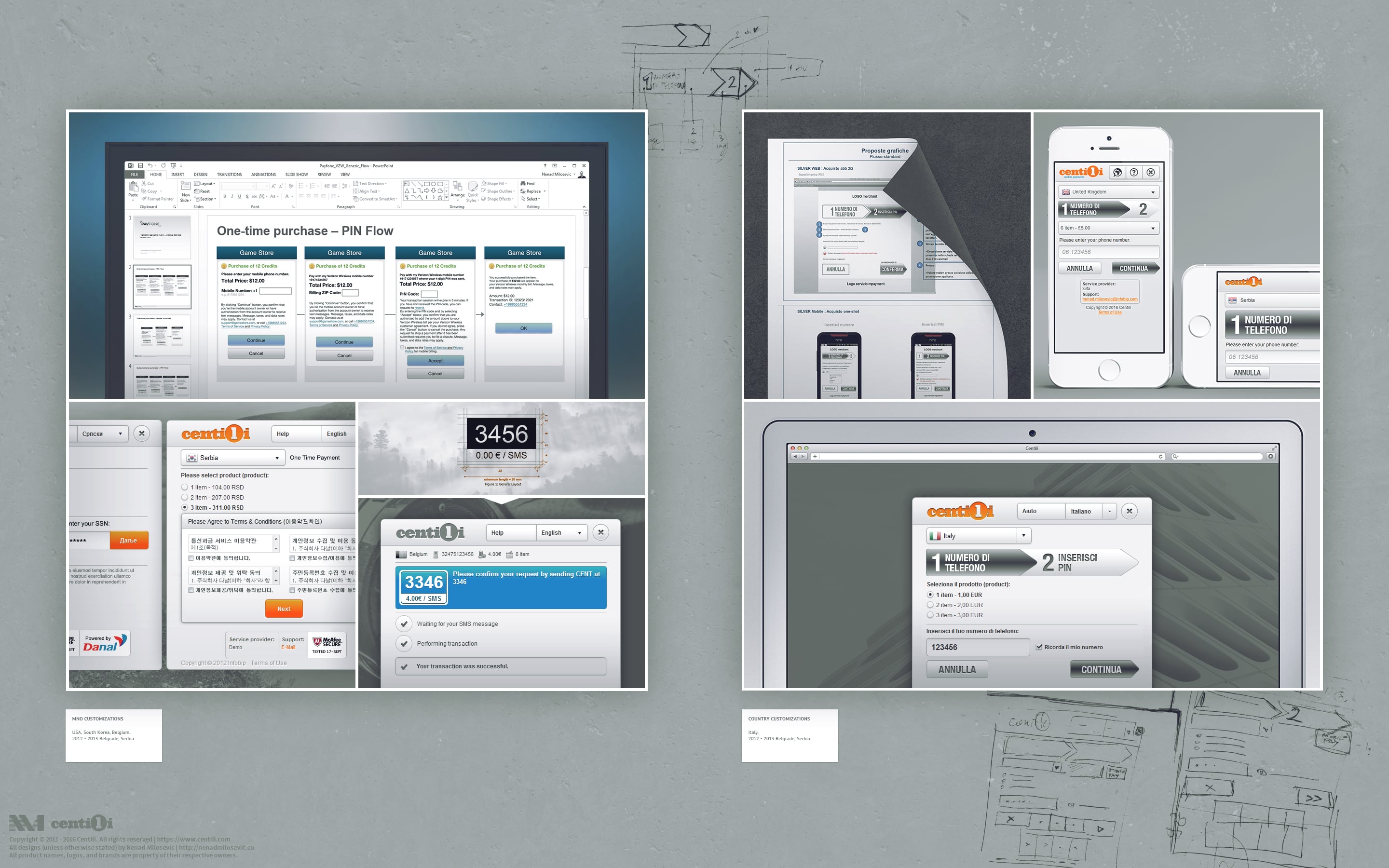
Mobile Network Operator and country customizations. ヾ(  ̄O ̄)ツ
Country regulations required yet another layer of complex customizations and most of those demands related to visual and interaction design. E.g. some modification of:
- Pages, modal dialogs, and flow steps.
- Input fields, dropdowns, labels, check-boxes, and other UI elements.
- Visual and textual content, warnings, additional info, etc.
👮 Security & trust
When we’re talking payments, security is the most important thing to users. Therefore some trust indicators are the must. I added MNO’s logos to convey trust, which is similar to ATM‘s strategy. Set of displayed supported card and bank logos on ATM put most doubts about data theft and security to rest. Likewise, users are more likely to enter their phone number into our Payment Page if the logo of their MNO is present.
")
My collection of gazillion MNO’s logos. (✧ω✧)
People already have the trust in a brand providing service, so rebranding of Payment Page is another excellent way to communicate a sense of security. Afterward, I added a simple icon of a padlock 🔒 near the phone input field, and I was totally flabbergasted 😱 how huge trust booster that was. I can’t remember the exact numbers but let me say we speeded up the average session duration by 20% at least. Talking about time, here’s a fun fact, average time on our Payment Page in 2013 was 3 minutes and in 2016 was approximately 30 seconds! Think about that, people now pay in just 30 seconds or less, and thus much less aware of act of paying.
👴 Legacy support
On top of everything, we needed to support Internet Explorer 8. I did it but we raised prices by 25% for those IE users! Just kidding, but frankly, supporting old browsers is hard.
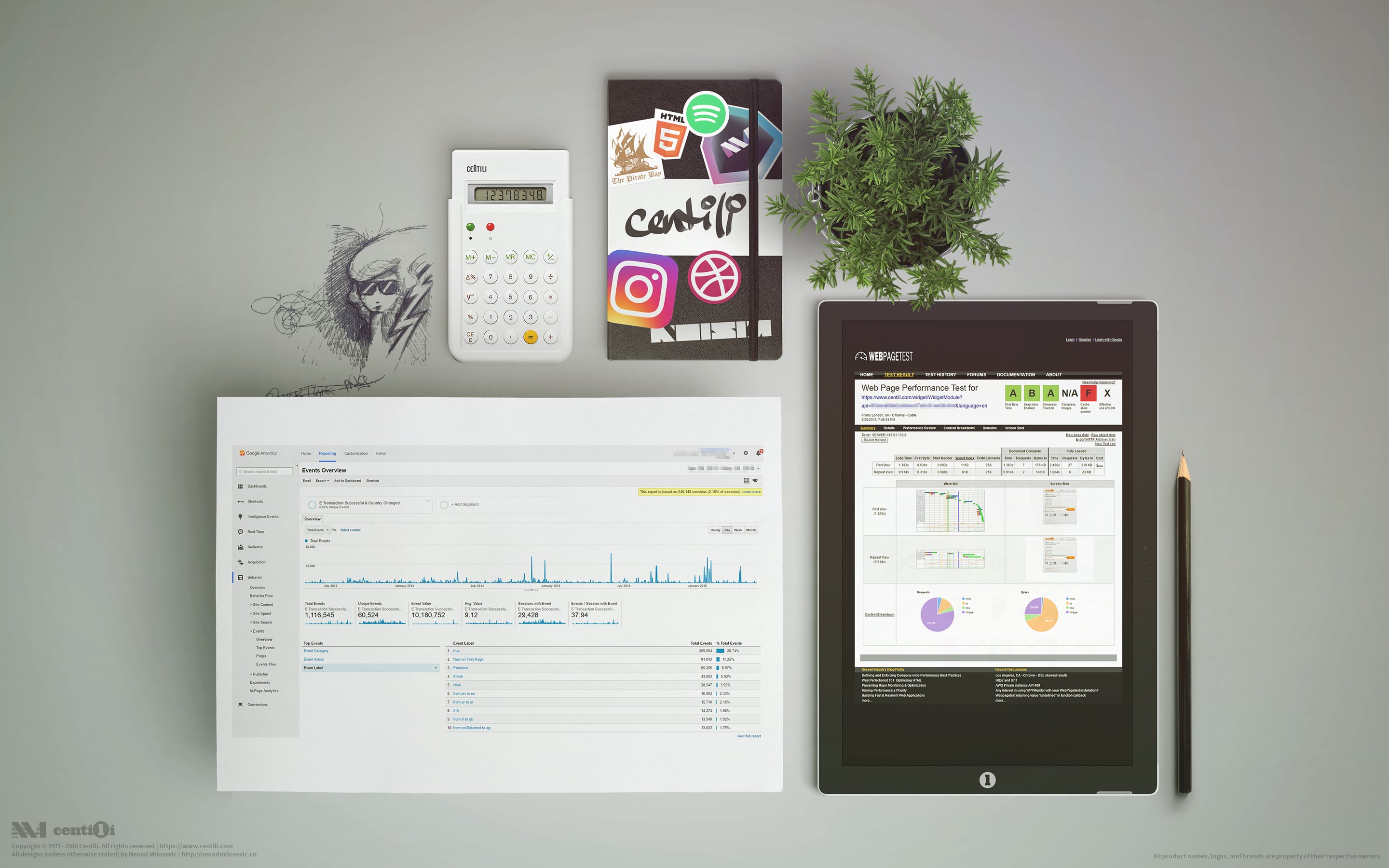
Measure success they say.
I monitored the user behavior by tracking custom events with Google Analytics, and that helped me retain the Payment Page flexible, but light sized.
As mentioned earlier, this was the original version of Payment Page. Version one. It was so much easier to build the second one from the top. We get to work powered with practical knowledge, experience, and data gathered from first version, so the second one turned out a lot more efficient, flexible, compact and easier to use.
⚠️ This page is part of a larger series of pages aimed at explaining the process of designing and developing mobile payment experiences. Learn more about “Mobile payments product design” here.
🚏 Next up → “Mobile payments: Admin panels”.

Admin panels
The Partner Panel is an administration application for merchants, mainly for creating and configuring the Services. Set of configurations assigned to one payment is called Service.

Old website
I wanted to create a Centili website visually unique and suited to the audience we targeted. On the other side, decision makers were gravitating to already proven design of the holding company.