Table of Contents
Date: 2015
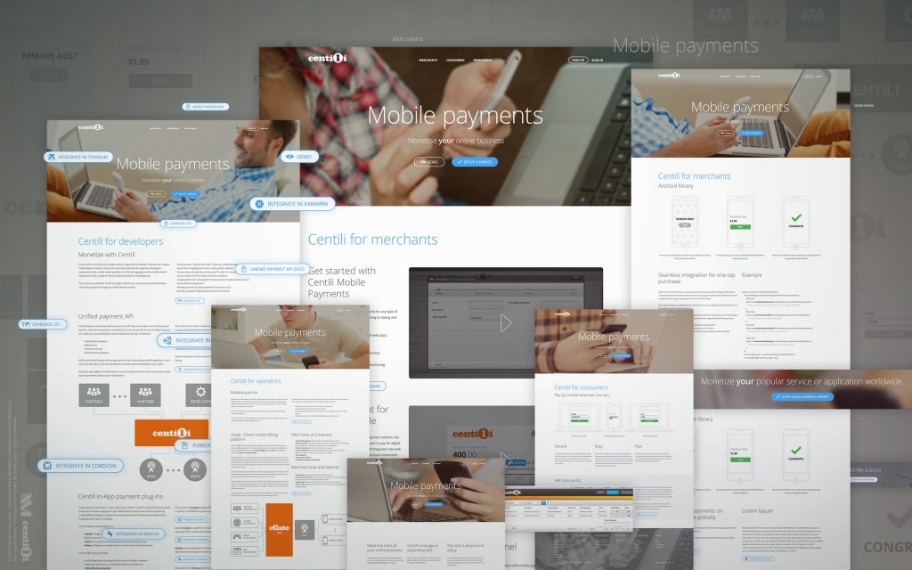
The old website was outdated, had misleading information, was loosely unorganized, out of style, and static—without a content management system. And most importantly, didn’t generated enough leads.
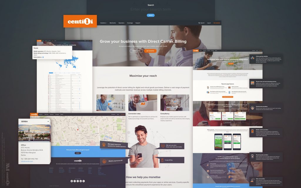
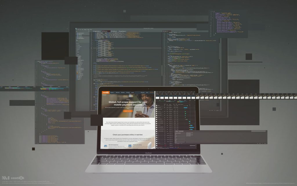
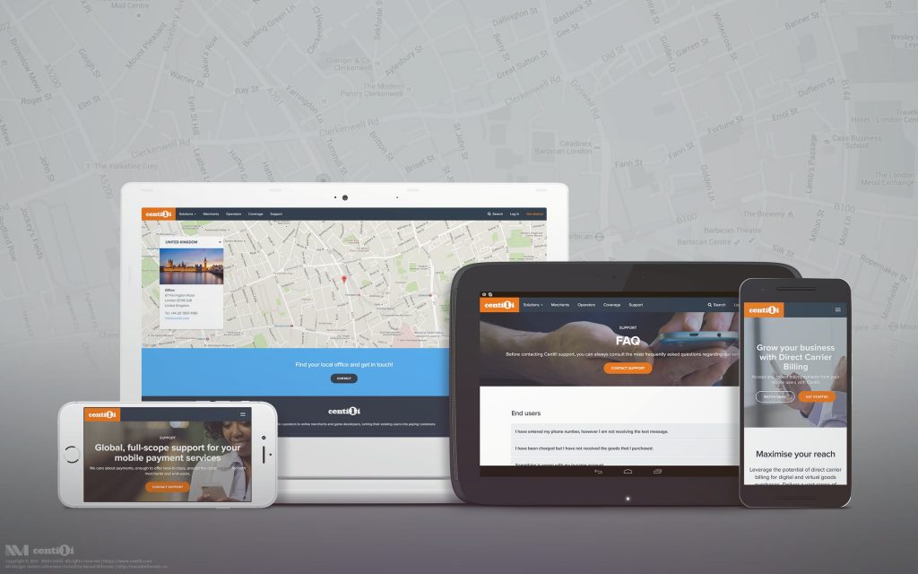
ℹ Merged with a blog and built on WordPress, the latest website with a content management system is currently live.
At first, I tried proactively to create it on my own, but very soon I realized that it would be much efficient and effective to confront the problem as a team. So naturally, I looked for a help from other teams.
⚔ Design and marketing realignment
Guys and gals that jumped in for the rescue were:
- Gotal from the Design team.
- Selena from Centili Marketing team.
- Darko and Mislav from the Marketing team.
- Suzana as the project owner.
- Denis to help us with SEO.
Project planning demanded tons of calls, meetings, discussions and task prioritization via email, Skype calls, chat, Polycom video calls, in person meetings, and anything in between. ✈️
👤 User modeling
By brainstorming, discussing, and collaborating closely together we decided to split our target audience into three main groups: end users, merchants, and resellers. We created personas for each group and carefully built user flows for each persona. Furthermore, we successfully created information architecture and sitemaps guided by those user profiles.
💈 Visual design
I helped Gotal to design the website, and Selena, Mislav, and Darko to write the copy and create the information infrastructure. Together, we were connecting the dots and bringing the fresh, functional and beautiful website to life!
⌨ Code
I applied designs to the WordPress theme I made using HTML/CSS/PHP/JS and Bootstrap framework. We automated our design/coding flows with the Grunt task runner 💻, using these plugins: grunt-contrib-less, grunt-contrib-cssmin, grunt-postcss, grunt-contrib-cssmin, grunt-contrib-uglify, grunt-contrib-copy and grunt-contrib-watch.
👀 Any cool plugins recs?
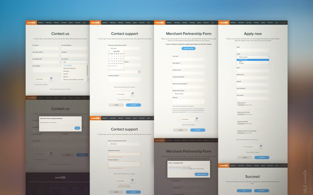
📑 Contact & apply forms
I developed three contact forms for the Centili website:
- Get started form for onboarding future clients.
- Contact support form for end users and merchants.
- Contact us form for everything else: partnership, technical questions, etc.
- Apply form for applying to job postings on a careers page.
I installed these features on all forms:
- reCAPTCHA to protect forms from spammers.
- Time limit security measure for preventing too frequent form submissions.
- Validity check for website input field. Prevents abusing forms for support related questions. E.g. if a user types in a popular or existing client’s website, she gets redirected to correct (usually Support) form.
- Smart validation with jQuery Validation Plugin.
- Checking of uploaded files: file size, extension, and renaming if the file with a same name already exists on a server (i.e. ‘my-resume.pdf‘).
- Saving entered information temporarily in a cookie so it’s possible to retrieve it back in case of a sending error, network problem, etc.
- Input field types, such as email, phone, website, date, etc, are set correctly.
- The first input field is in focus upon loading the page so user can start typing right away.
- Countries field has autocomplete with alternative country names using Select To Autocomplete.
- Inline error handling before the form submission on client and server side.
📰 Wordpress Blog
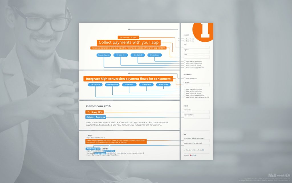
I created the WordPress Meta Box as a needed addition to CMS. The Meta Box provided extra features for editing pages or posts, and some search engine optimizations. For marketing and editorial teams I even made a tutorial about how to use it.
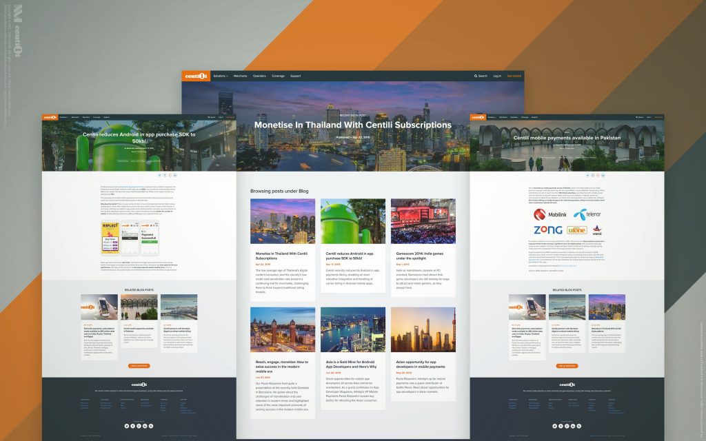
In a new version, I merged the blog and website, making it easily maintainable from the single CMS; thus only one account is enough for updating both. Plus, the search is now returning combined and sorted results from website pages and blog posts.
😷 Any testing is better than none!
While coding a website and blog, I tested ’em on as many devices as I could. A huge help was the BrowserStack service, an excellent site for cross-browser testing, with just one small downside: no featured phones whatsoever. It wasn’t uncommon for us to ask friends and family to donate their old phones for our testing purposes. I tested on several virtual machines with different operating systems and various browsers using VirtualBox. I did my best to make sure website and blog looked as good as possible on all devices we could lay our hands on.
🔍 SEO
To make the Centili website search engine and social network friendly, I utilized these tools among the others:
- Facebook’s Sharing Debugger.
- Twitter’s Card Validator.
- Google’s Structured Data Testing Tool.
- Bing’s Markup Validator.
By adjusting and fine tuning the markup, I optimized pages and posts, not only to display correctly but to enable search engines to display structured information more creatively. Think Knowledge Graph cards.
Denis and I optimized the Centili website for search engines and improved the visibility by following best practices and only the white hat techniques. We identified problems with a Screaming Frog and other similar tools Denis had up his SEO sleeve. I added the sitemap to major search engines, plus Chinese Baidu and Russian Yandex. With a little help from my friend from China, I succeeded in adding it to the Baidu and luckily for me, Yandex was already translated into English.
The behavior and user interactions I saw in these desktop and mobile tests helped me to pinpoint usability issues and generally experience, interface, and interaction problems. I wish we did more of these.
I’m pleased with the results we accomplished: ten times more business proposals from potential merchants! Converting leads into clients like a boss! 🎩
⚠️ This page is part of a larger series of pages aimed at explaining the process of designing and developing mobile payment experiences. Learn more about “Mobile payments product design” here.
🏁 Next up → “Mobile payments: Retrospective”.
Retrospective
We took great care of our consumers, clients and partners, and put lots of effort to meet their needs. We fixed the bugs and met the feature requests in no time, but we remained focused and in control.
Introduction
Back in 2011, I started to work at Centili where I was the product designer for five years. Centili is a B2B and B2C mobile payments solution company, particularly focused on micropayments 💸.


