Table of Contents
Date: 2011
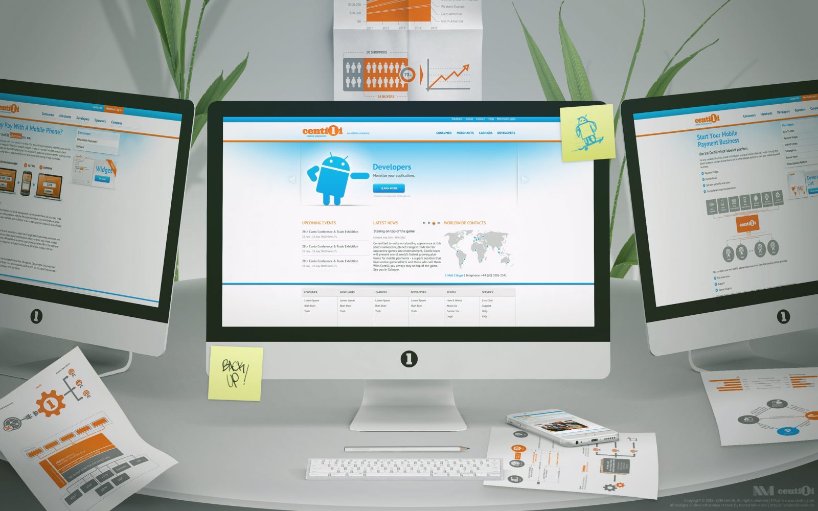
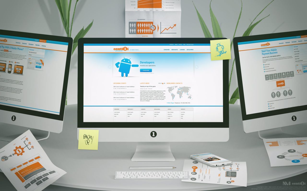
Maja from marketing and I, were on a quest to craft the Centili website. So, I started by exploring ideas on how we should present our product in the best way. Together we researched our competitive landscape and conducted some internal surveys, collected a valuable info and some extra insights and research from holding company’s colleagues. Then, we brainstormed, discussed features, made sitemaps, user flows… I started my design process by drawing sketches, drafts, concepts, wireframes, and storyboards before creating mockups and prototypes.
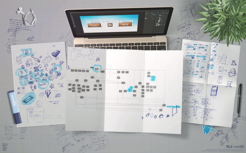
Making website 1.0. Sitemaps, user flows, drawings, icons, sketches, illustrations and first designs.
ℹ Grids are very important! Make sure to use the grid wherever you can and you’ll thank me later. Here I used simple 12 column grid with a small gutter of around 10% of col’s width. Bootstrap’s grid is a good start for wrapping your head around basic grids, and for more in depth view, take a look at Grid Systems in Graphic Design classic.
🎯 Ready, target, tailor!
I wanted to create a Centili website visually unique and tailored to the audience we targeted. On the other side, stakeholders were gravitating to already proven design and principles of the holding company’s website. I understood why but that was not enough of a reason not to further tailor the website to our users. The problem was that brand authority parent company’s website had didn’t play a significant role here because our holding company is in telecommunications and messaging business and we are in payment and gaming industry. Our website should have reflected that. Take Google and Android for example, or even better Coca-Cola and Fanta. Drastic difference between those websites.
I tried hard to explain my intentions and fought to defend my ideas. I tried to justify my reasons, but my idea almost entirely got rejected 😡. Moreover, that decision affected other parts of the design such as branding and product design. We basically tailored our designs to the users of our parent company’s products and services and not to our own!
Fast forward five years, thankfully my efforts have paid off and my original idea is now fully applied. Current Centili website doesn’t have any major connections to the parent’s company anymore.
🤖 Payment page demonstration
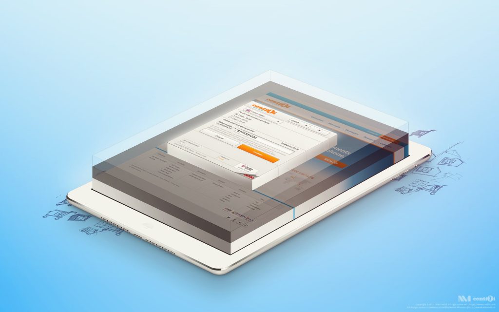
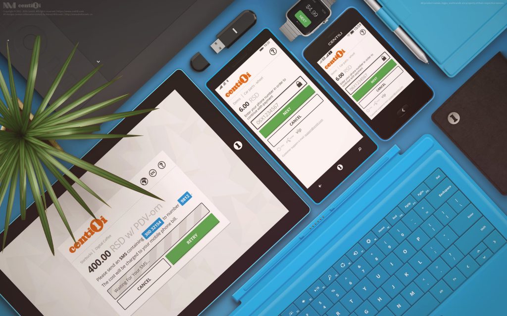
One of the features we always had was the website live demo of our Payment Page, which was a real application with mocked-up data for demonstration purposes. It was the most visited page on our website―evidently people wanted to experience what we had to offer first-hand.
ℹ️ Take a look at user onboarding on Centili website (ver 1.0) video, and Payment Page (ver 1.0) integration video tutorial from 2012.
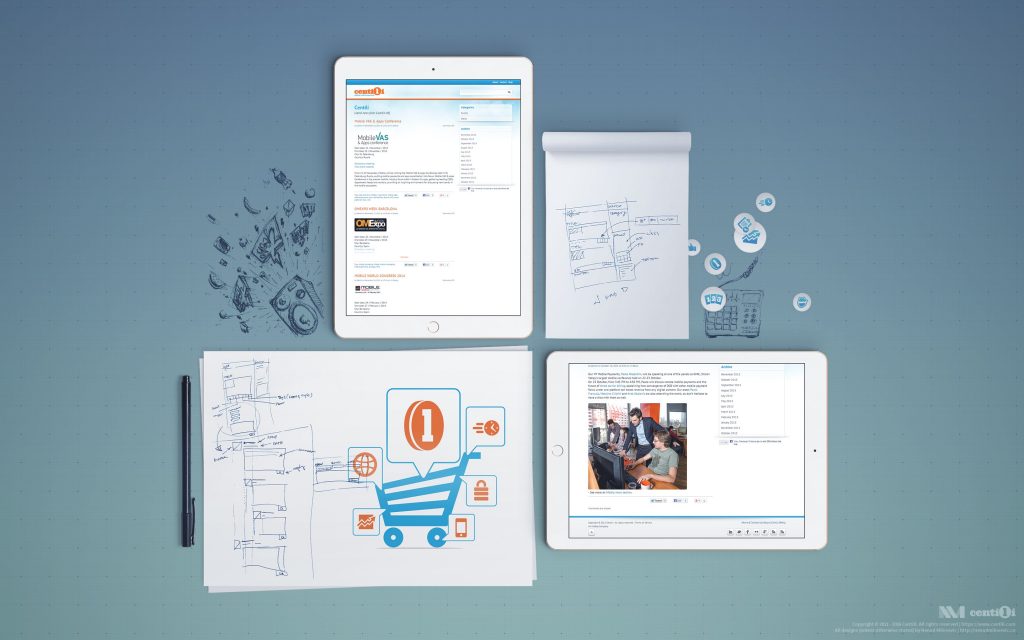
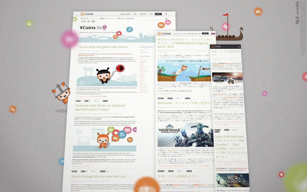
Our marketing team was reinforced by the new member Selena; they needed a CMS for the blog ASAP, so I created a new WordPress blog from the ground up.
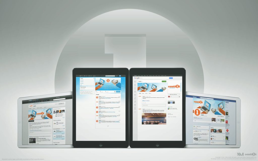
Marketing team needed to share news and events over social networks with a correctly displayed image, title, and description. Therefore, I took care of that and enriched social network profiles with some swagger isometric-style illustrations.
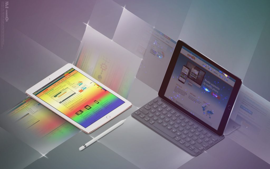
We used Google Analytics for statistics and CrazyEgg for heat maps.
⚠️ This page is part of a larger series of pages aimed at explaining the process of designing and developing mobile payment experiences. Learn more about “Mobile payments product design” here.
🚏 Next up → “Mobile payments: ¥coins”.
¥coins digital wallet
The ¥Coins is a virtual currency that enables paying for digital content in Japan. ¥Coins are tokens redeemed with real money that allow users to buy virtual goods over the internet. They can buy tokens via direct mobile billing, and that will charge the user’s account.
Payment page
The initial version of the Payment Page had a ton of UI elements crammed and bloated on one single page, and It was like everything was competing for attention. There was no focus! I removed unnecessary buttons and fields first; then I took more a step-by-step approach…
