Table of Contents
Date: 2011
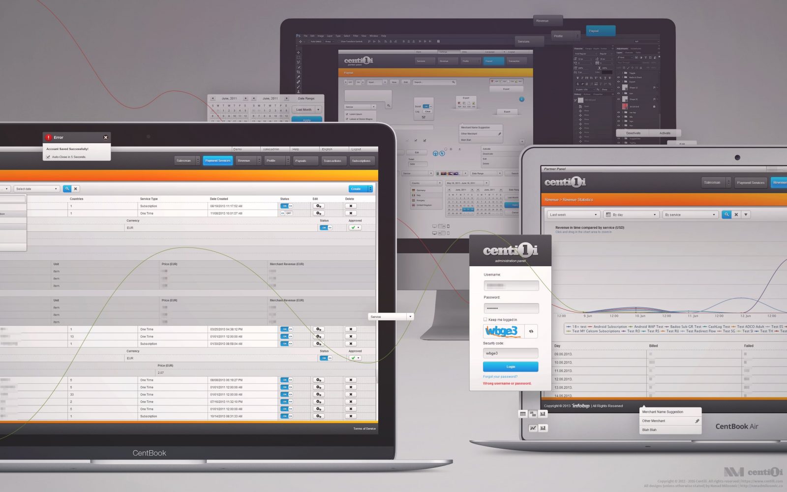
The Partner Panel is an administration application, mainly for creating and configuring the Services by merchants. Set of configurations assigned to one payment we called Service; i.e. the Service contains parameters and information regarding selling items, such as amount, price, targeted countries, and integration procedure.
The Partner Panel offers a ton of other features, e.g. analytics, payment transactions history, customization options, API configurations, etc. Too many to list them all here, let alone explain.
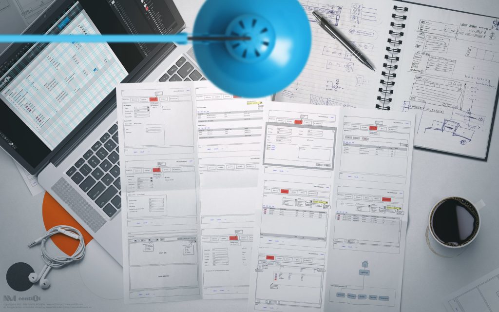
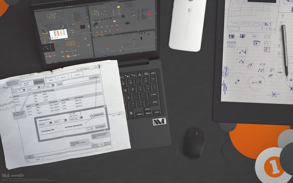
As always, I start my design process by research, collecting information about users, creating personas, thinking about goals and problems, sketching on paper, wireframes, building hi-fi mockups, storyboards, and, developing an array of low / high fidelity prototypes. All that good stuff!
“A prototype is worth a thousand meetings.”―Mike Davidson.
For the front-end development we used a handful of frameworks and tools over time such as GWT, PrimeFaces, JSF, Google Charts, Highcharts.

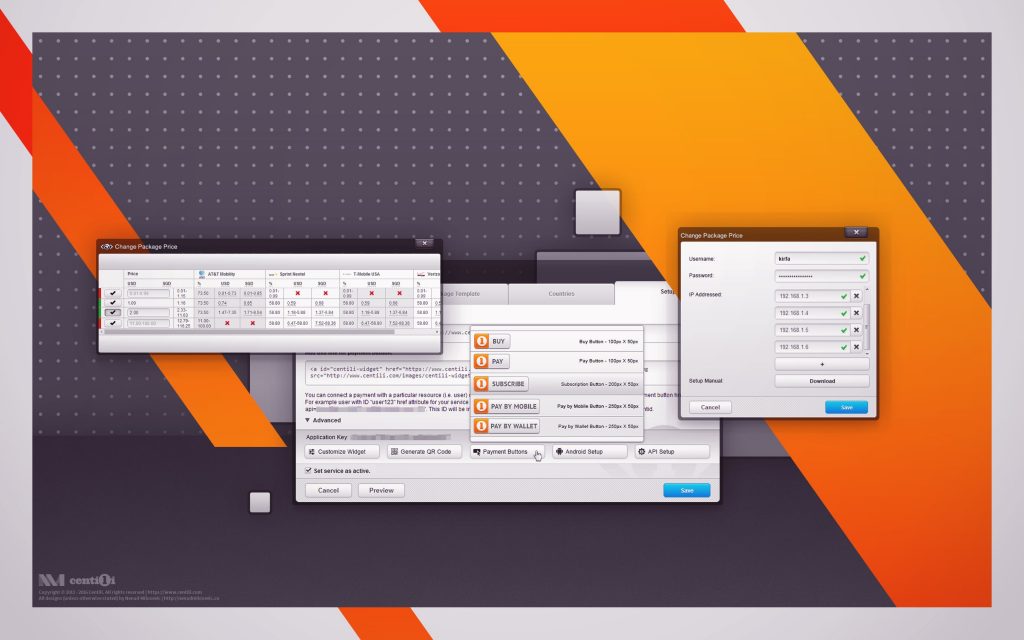
From mockups to real deal. Visualisation, analytics, statistics, tables, trees, dropdowns, input fields, buttons, menus, dialogs, dialogs in dialogs, dialogs in dialogs in dialogs… Damn!
Please be easy on judging those funky gradients―that was fresh and cool back in the 2011. 😎
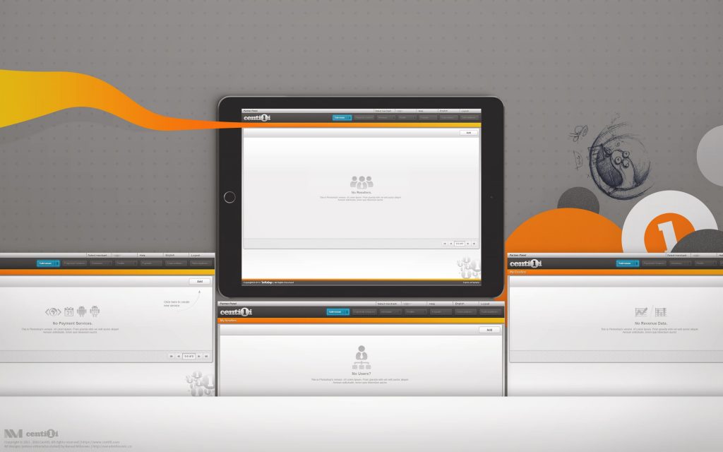
Btw, I did not forget to implement the details such as empty states, loading animations, custom captcha, etc. 😉
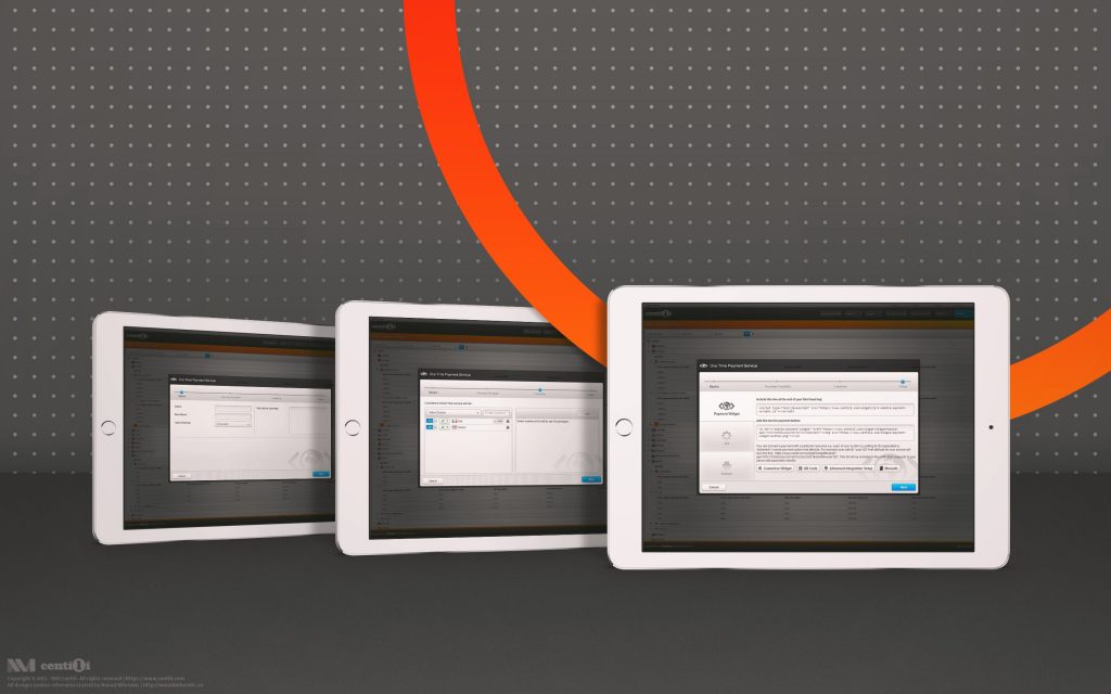
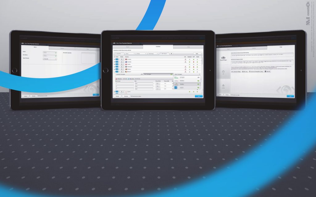
🎛 The Wizard for creating and editing Services
The heart of the Partner Panel is the Wizard. Damn complex section of the app for creating and configuring Services. It had a bunch of pages, lists, tables, menus, and literally tabs in tabs, and dialogs in dialogs. An interface and interactive nightmare, a huge design challenge. I designed it and redesigned it a dozen times to get it right.
Even tho I knew how to make it responsive, I was under the pressure from stakeholders to work on new features. I started working on it but I never had a chance to finish it. 🙁
🗄 Other panels
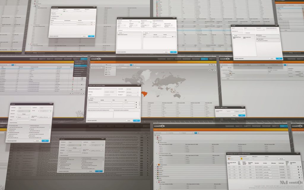
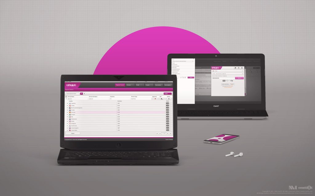
Alongside the Partner Panel, there are more panels for maintaining, operating and configuring the Centili system; such as Finance, Customer Care, Admin Panel, ¥Coins Panel, TrEng Panel and few other internal utilities. To talk about these now is way beyond a scope of this case study even tho I designed them, so I’ll just attach a few screenshots and skip them altogether. Except ¥Coins Panel, I’ll talk about it a bit later.
💰 Finance Panel – application for housekeeping money related tasks used by merchants, resellers, and Centili itself.
💱 Admin Panel – application for managing localization and configuration of other Centili applications.
📜 Customer Care – providing purchase history for the end users.
Over time, the panels grew in all directions, feature by feature, option by option, table by table… Reinforced with new programmers Dule and Nemanja, front-end product development teams grew, too. Good people, good times! 🍻
🛠 Panel customizations
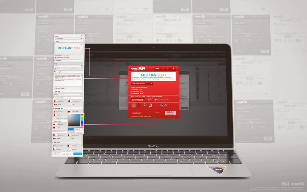
I’ve mentioned earlier that one of our selling points was the white labeling, i.e. rebranding, and showed how it works with the Payment Page. There’s a full-screen customization dialog for Payment Page inside Wizard for merchants to customize the look and feel. Main options available for customization are the logo, dimensions, copy, content, code, colors… All those parameters could be saved as presets for later use on other services.
Taking into account our resellers, we created and offered a way of customizing the panels as well. We provided them with a tool similar to merchant’s tool for customizing Payment Page. We made it pretty versatile: resellers could completely change the appearance of panels and match it with their Payment Page design.
📊 Visualising revenue, traffic, transactions…
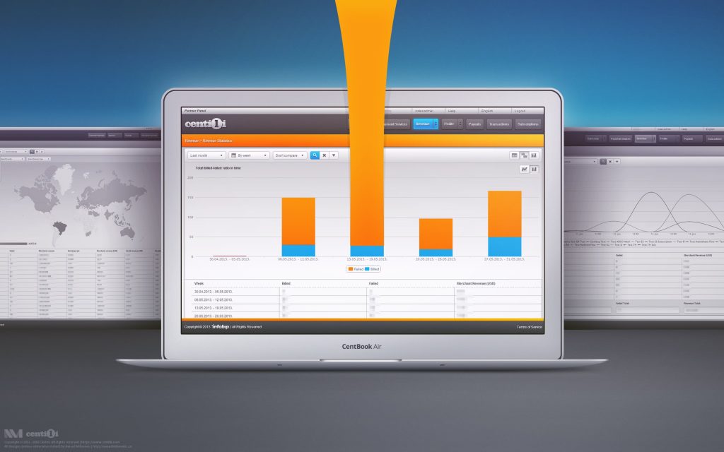
Partner Panel is used to process a huge amount of transaction data which we visualized to help our merchants better understand what’s going on. And what’s the better way to present it than using cool looking maps, graphs, and charts!? So we did exactly that, adapted the HighCharts library to fit our visual design.
⚠️ This page is part of a larger series of pages aimed at explaining the process of designing and developing mobile payment experiences. Learn more about “Mobile payments product design” here.
🚏 Next up → “Mobile payments: Old website”.
Old website
I wanted to create a Centili website visually unique and suited to the audience we targeted. On the other side, decision makers were gravitating to already proven design of the holding company.
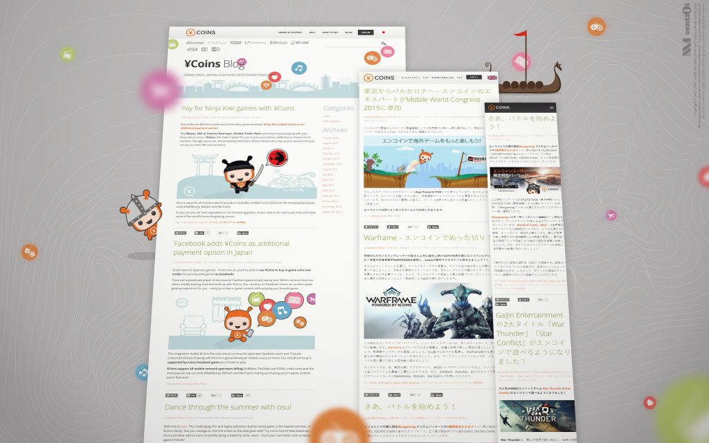
¥coins digital wallet
The ¥Coins is a virtual currency that enables paying for digital content in Japan. ¥Coins are tokens redeemed with real money that allow users to buy virtual goods over the internet. They can buy tokens via direct mobile billing, and that will charge the user’s account.
