Table of Contents
A series of case studies in mobile payments from 2011 to 2015.
Introduction
Date: 2011
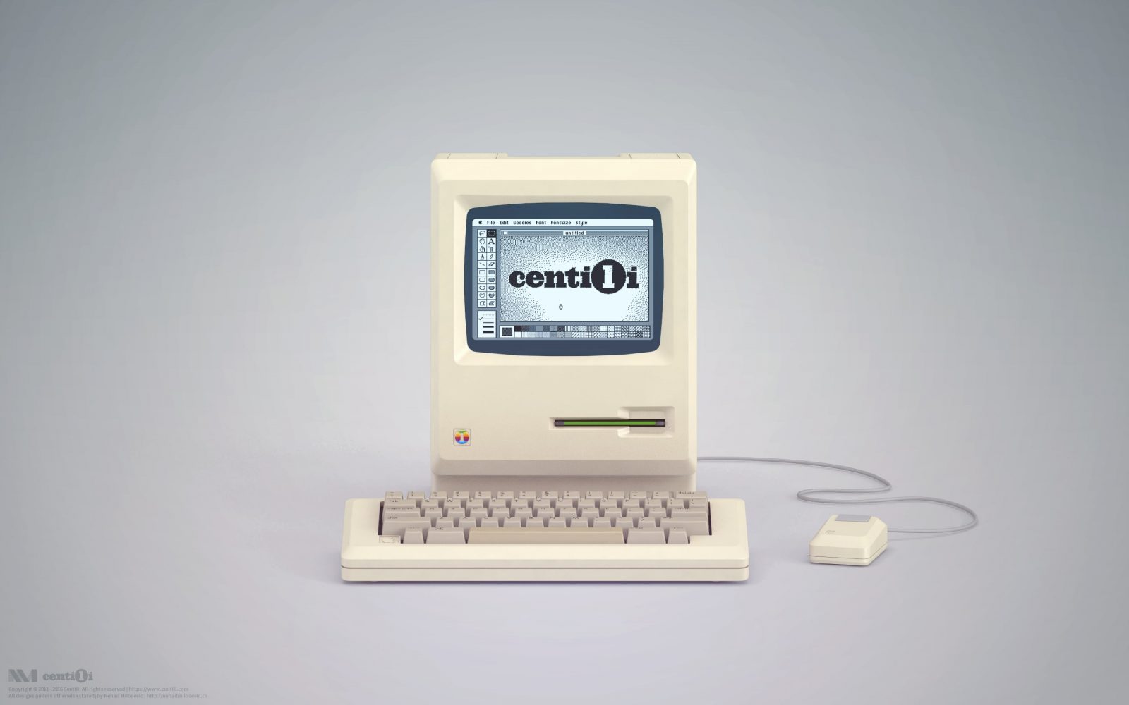
I started working at Centili where I was the interaction and product designer for five years. Centili is a B2B and B2C mobile payments solution company, particularly focused on micropayments 💸.
Old payment page
Date: 2011
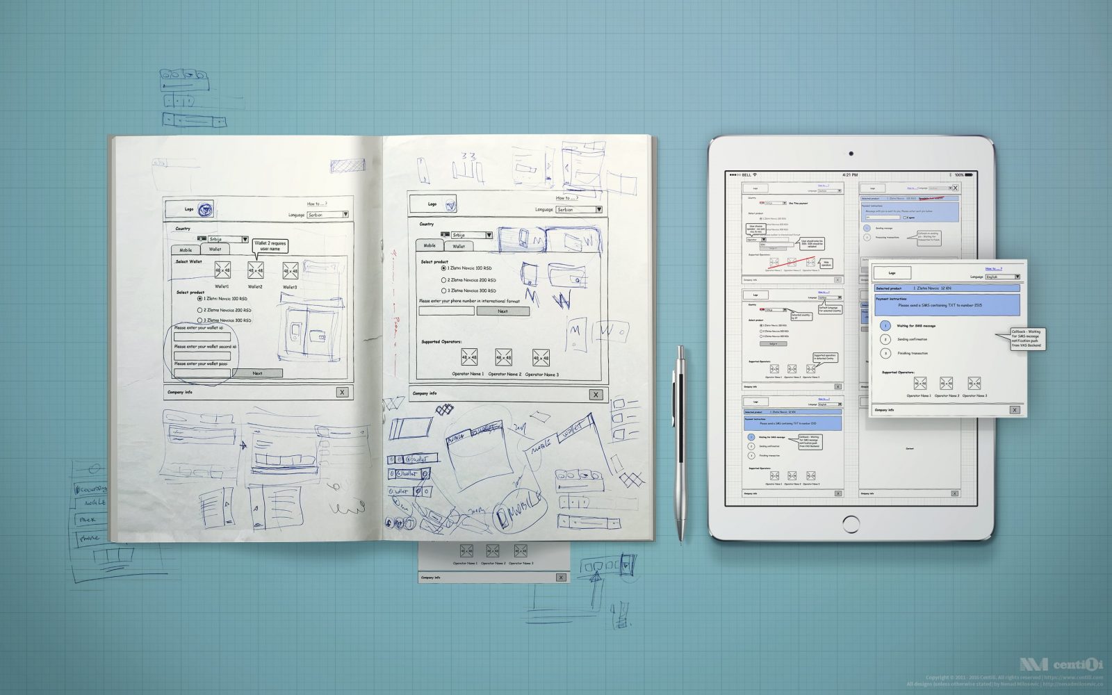
In collaboration throughout the design process, I draw on a whiteboard, sketched on paper, made blueprints in Pencil, created mockups and storyboards in Photoshop, and produced HTML/CSS/JS hi-fi prototypes.
Admin panels
Date: 2011
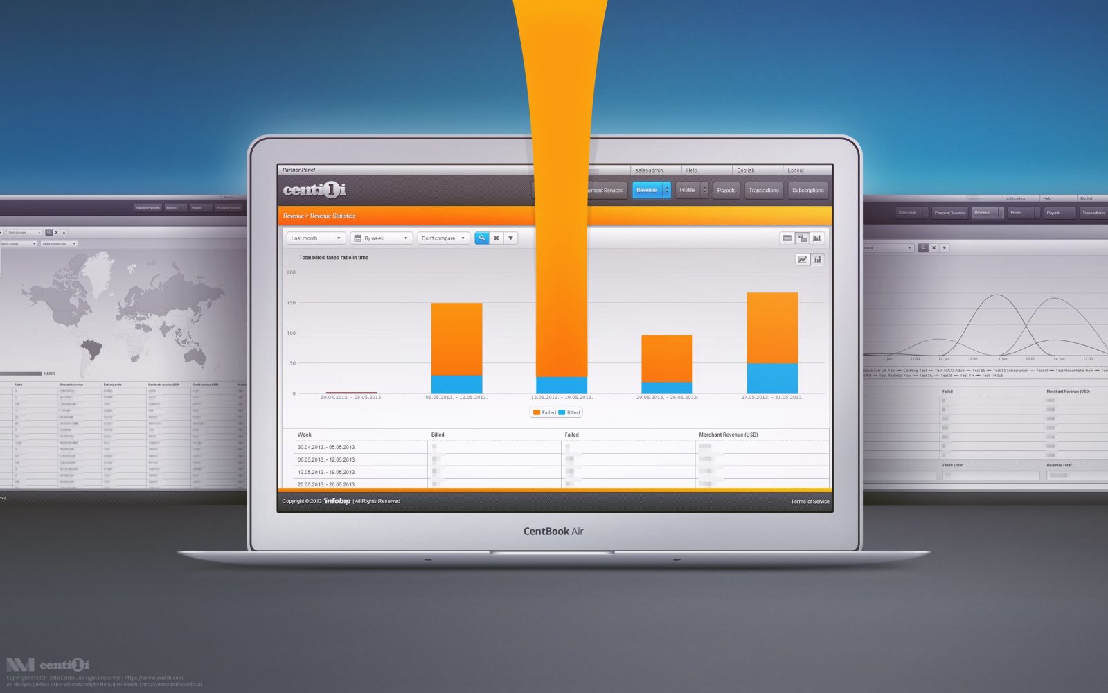
The Partner Panel is an administration application for merchants, mainly for creating and configuring the Services. Set of configurations assigned to one payment is called Service.
Old website
Date: 2011
I wanted to create a Centili website visually unique and suited to the audience we targeted. On the other side, decision makers were gravitating to already proven design of the holding company.
¥coins digital wallet
Date: 2013
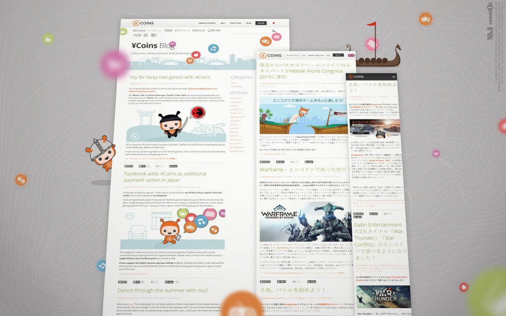
The ¥Coins is a virtual currency that enables paying for digital content in Japan. ¥Coins are tokens redeemed with real money that allow users to buy virtual goods over the internet. They can buy tokens via direct mobile billing, and that will charge the user’s account.
Payment page
Date: 2014
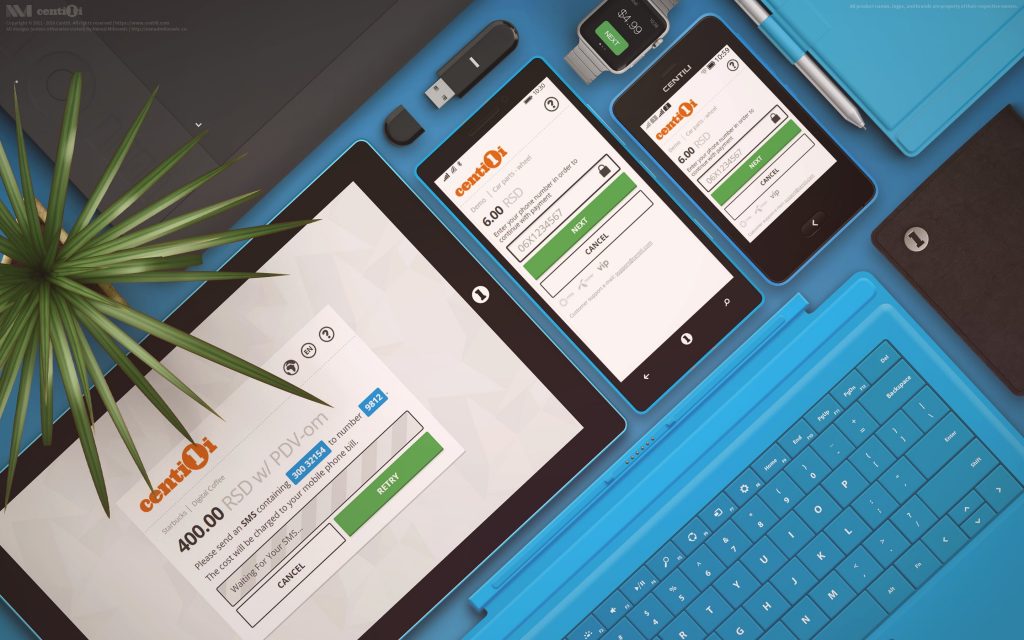
The initial version of the Payment Page had a ton of UI elements crammed and bloated on one single page, and It was like everything was competing for attention. There was no focus! I removed unnecessary buttons and fields first; then I took more a step-by-step approach…
Website
Date: 2015
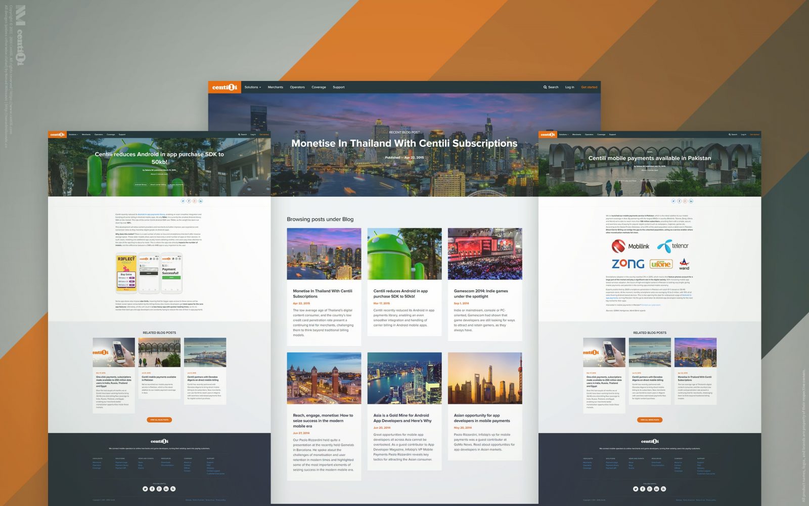
The old website was outdated, full of misleading information, loosely unorganized, out of style, and without a helpful CMS. At first, I tried proactively to create it on my own and succeeded to an extent…
Retrospective
Date: 2015
We took great care of our consumers, clients and partners, and put lots of effort to meet their needs. We fixed the bugs and met the feature requests in no time, but we remained focused and in control.

