Table of Contents
- Hello 👋
- How I started redesigning by sketching
- Browser, Session View, and Device Rack
- Header, Project Tabs, and Status Bar
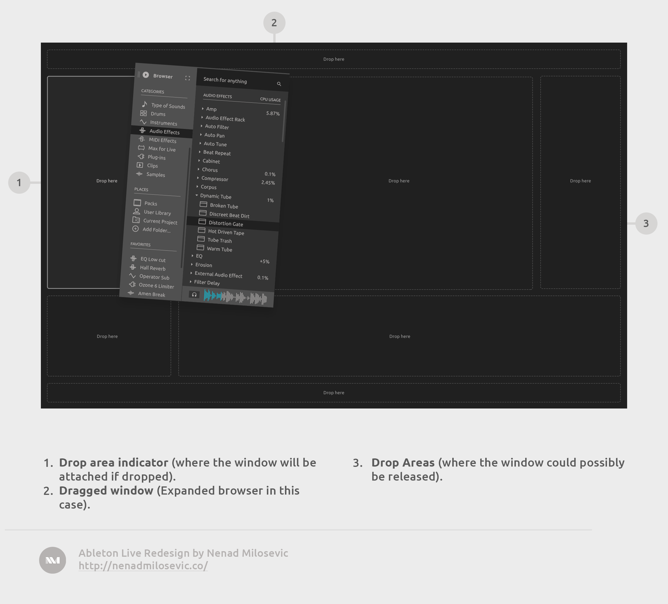
- Browser and Detachable Windows
- Session View
- Device Rack
- 💌 Subscribe to my newsletter
- Browser, History, and Expanded Mixer
- Expanded Mixer and History
- Expanded Browser and Expanded Mixer
- Expanded Browser
- Wrap up
- Edit 1
- Edit 2
Date: 2017
Hello 👋
This is my unsolicited UI redesign of the Ableton Live. I did this to showcase my design skills to peers working at Ableton, where I would love to work as a designer.
The entire process and elaborate case study of UX and UI design including guerilla UX research, interviews, sketches, drafts, wireframes, iterations, interface ideas and everything in-between. UI design galore.
Let me introduce myself. My name is Nenad and I’m interaction and interface designer. In addition, I have more than twenty years of experience in making and producing electronic music.
The idea here was to collect the information about what Live users thought needs improvement. Construct a Hypothesis. Research it some more. Redesign it using my design intuition and skills. Test it to verify everything is going in the right direction. And finally, present the results.
To make sure I don’t get misunderstood, I feel the need to quickly touch on what this isn’t:
- This is not some kind of replacement of the current design and I don’t claim that it’s better. I love current UI, but I also believe that everything can be improved.
- I’m not trying to just sell feature ideas. I’ve chosen to implement the new features in my redesigns because I think that’s a good way to show how I think as a designer. I didn’t want to introduce a featuritis either.
- Even though very helpful, I didn’t blindly follow what Live users said in surveys I conducted. Because 1. what users assume they need do not necessarily align with what they really need. 2. I didn’t conduct usability testing to see what actually needs fixing and how users behave (that was way beyond the scope of this project).
- Believe it or not, I need to write this one (and even make it bold): It’s not a skin/theme. It can not be purchased/downloaded.
First questionnaire about Live users’ habits, pain points, and joys
As with any instrument, everybody has slightly different approach how to play/use a DAW. So, I asked Live users about their habits, pain points, and joys.
The first survey was about what users thought should be fixed and what works fine (questionnaire results from 350+ Live users). I pulled out the most mentioned features from all 4000 open-ended answer and created the list I’ve used almost as a backlog. I’ve ignored requests for the Arrangement view simple because I didn’t have the time to do it. I think that the Arrangement view is very important, and I feel the need to write this also: I didn’t ignore the Arrangement view because I think that it should be removed from Live!
Second survey about feedback on my redesigns
The second survey took around 150 users. It was all about collecting the user feedback on what I’ve done and refining my redesigns upon it. You can view the feedback survey results here, but I’m gonna include the appropriate charts inline wherever applicable. Overall, users were happy with the results.
I need to mention one more thing here, I’m not a UX researcher unfortunately but I would love to learn some of the skills needed for conducting good research. In a way, that’s why I did this project.
I have used different online communities to get to the Ableton Live users (thanks again guys, this was super helpful). If you’re interested in these conversations, feel free to check out the links or screenshots below.
- Ableton Forum Part 1 (link) and Part 2 (link)
- Gearslutz (link)
- Ableton Live Facebook Group (link)
- Ableton Addicts Facebook Group
- Ableton Subreddit Part 1 (link) and Part 2 (link)
How I started redesigning by sketching
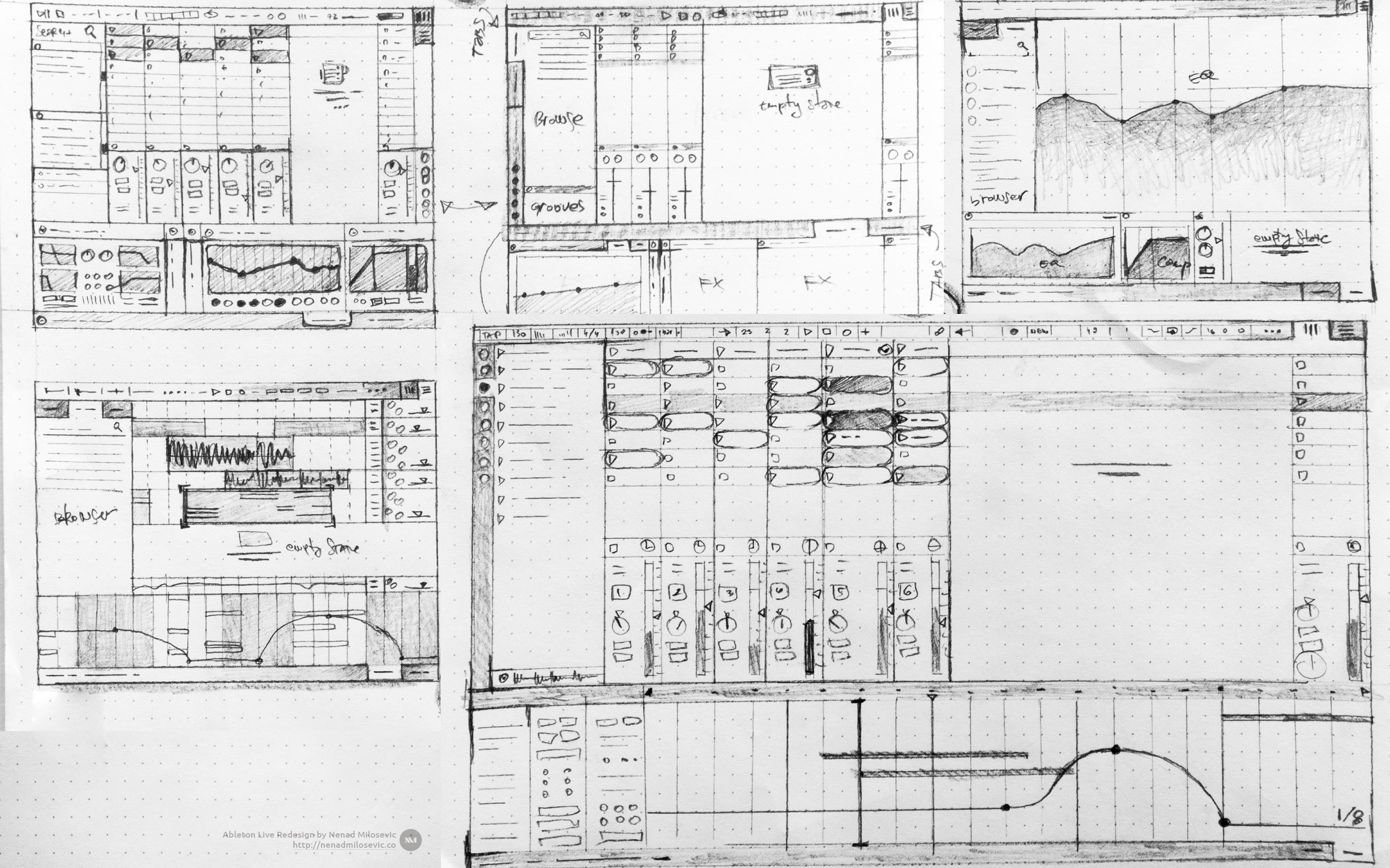
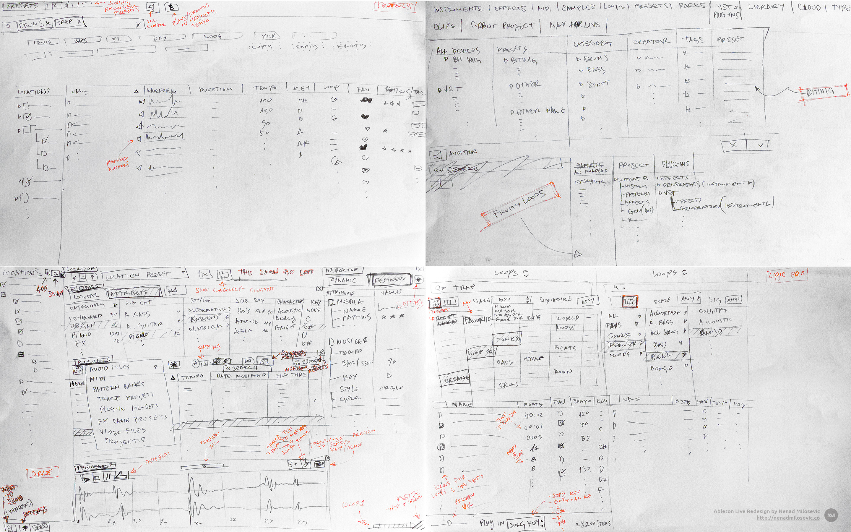
Excited and uncertain in which direction to go, I started exploring ideas by sketching on paper. I’ve always used sketching as a visualization and brainstorming tool. Later on, I’ll be showing more of Extended Browser iteration sketches and some of the competition analysis as well.
Browser, Session View, and Device Rack
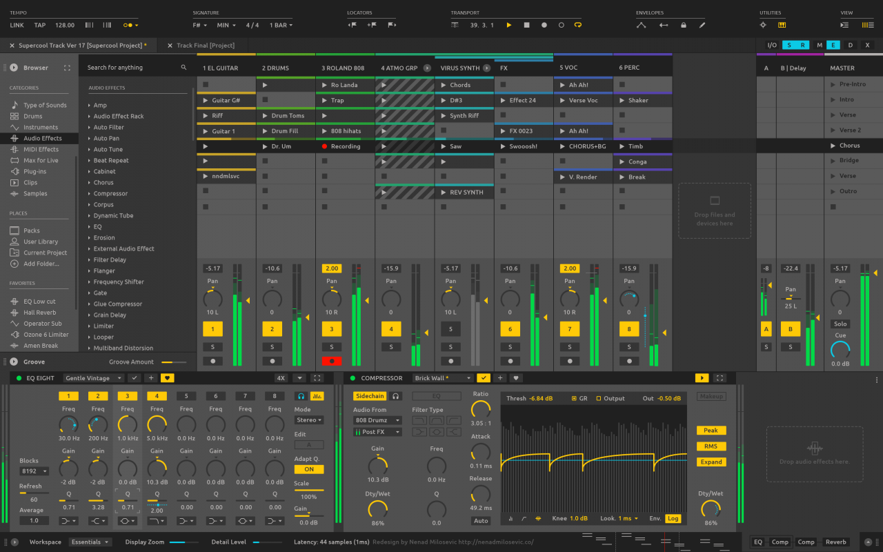
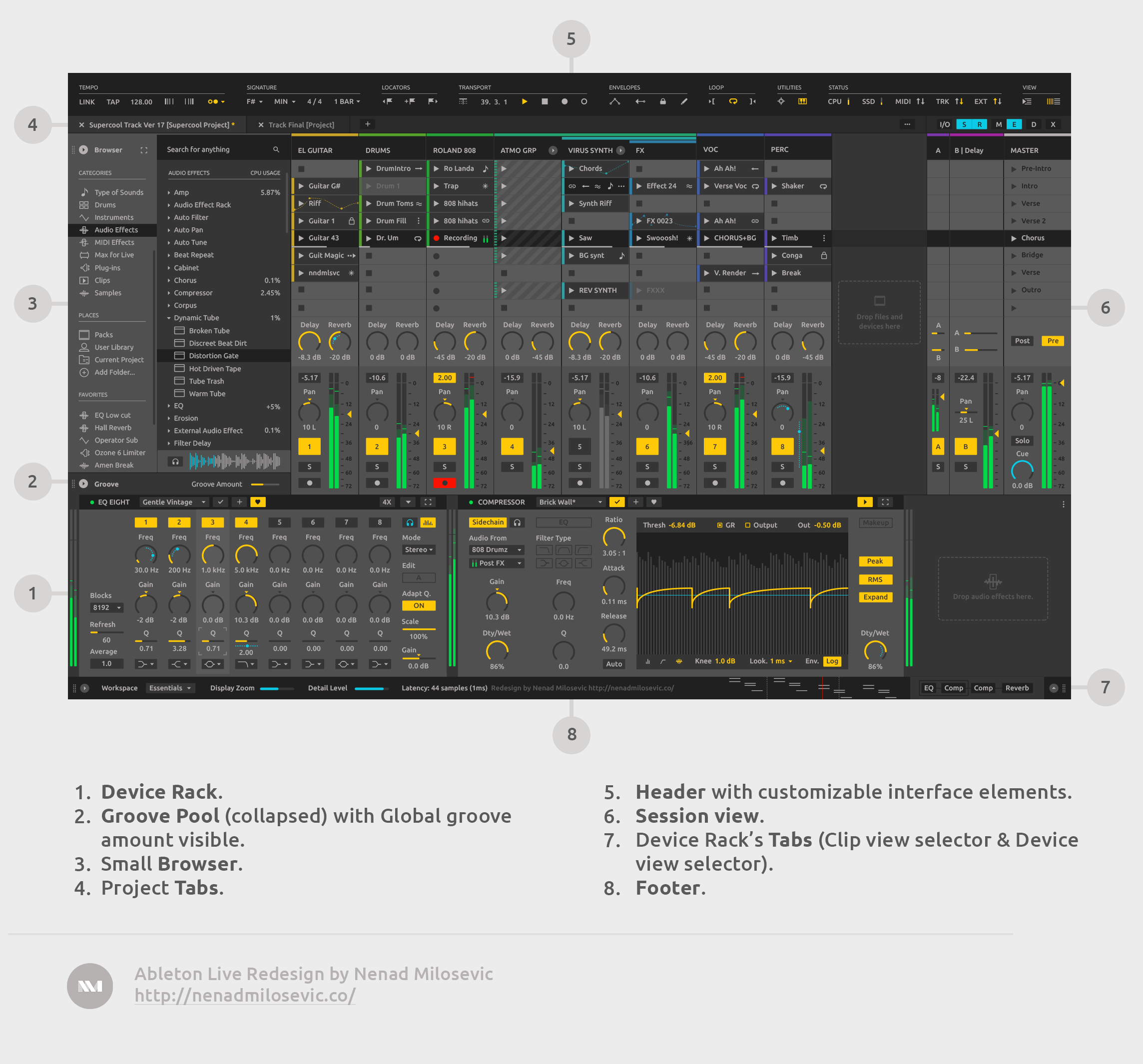
I wanted to keep the main composition of the windows and general feel of the current Live application the same. Besides the obvious reasons as getting used to new window arrangements, I didn’t want our musicians to feel like someone replaced their guitar with a trombone, so to speak. However, I’ve introduced an option to drag the windows around if needed.
Header, Project Tabs, and Status Bar
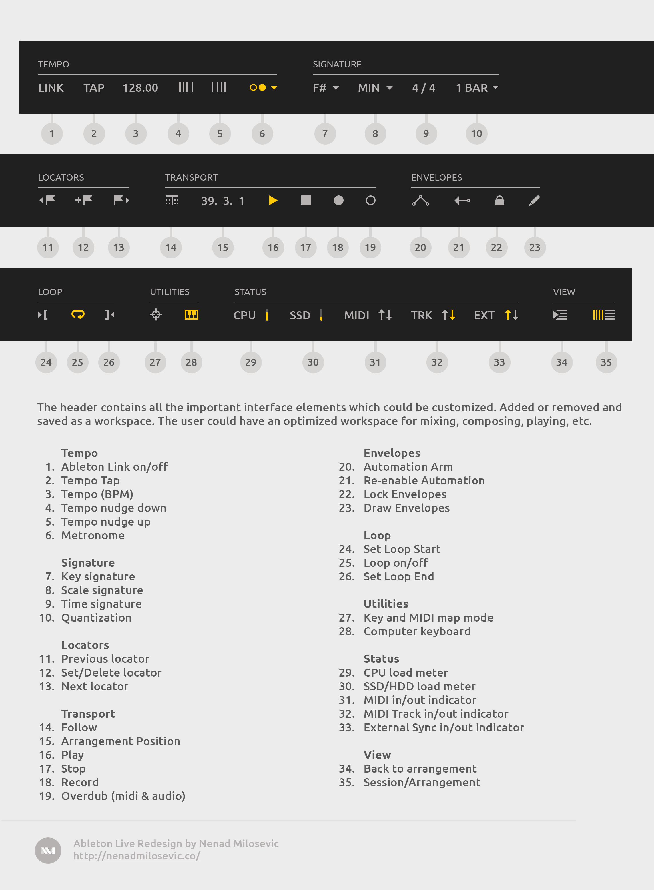
Header with all possible elements
I regrouped, changed, removed, and added some of the buttons into the header. Grouping is a very effective tool that could help users to quickly understand the complex interfaces.
Some of the original groupings didn’t work for me. For example, Envelope group consists of buttons found in three different locations in the current UI. I regrouped them together because all four buttons are for controlling the envelopes in some way. This would help new as well as existing users but that should be tested of course.
Although I’m showing all the header groups and elements here, users could remove the ones they don’t use and rearrange them to their liking.
This is what Live users think about header redesign. Keep in mind they didn’t test it or even tried it, it’s all just an option based on what they saw in my static mockup images.
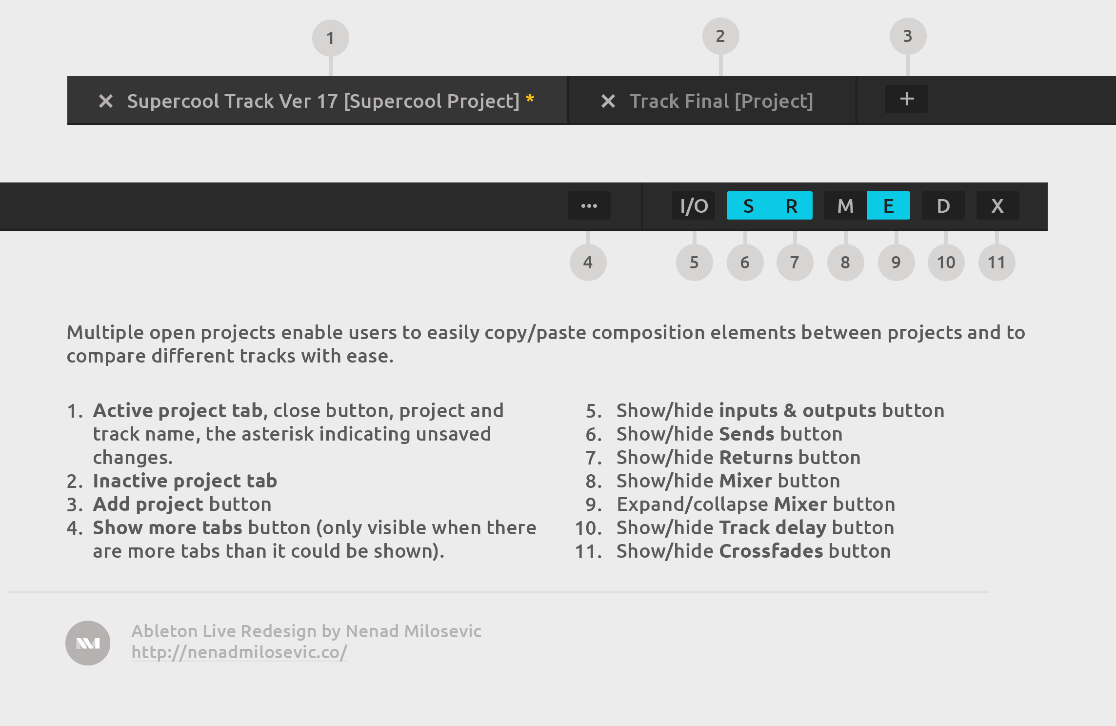
Project Tabs and View Options
Tabs should enable users to open multiple projects at the same time and copy elements between them. Visibility of the Project Tabs could be adjusted from the preferences, so you can hide it if you don’t use it. This is how users rated Project Tabs idea:
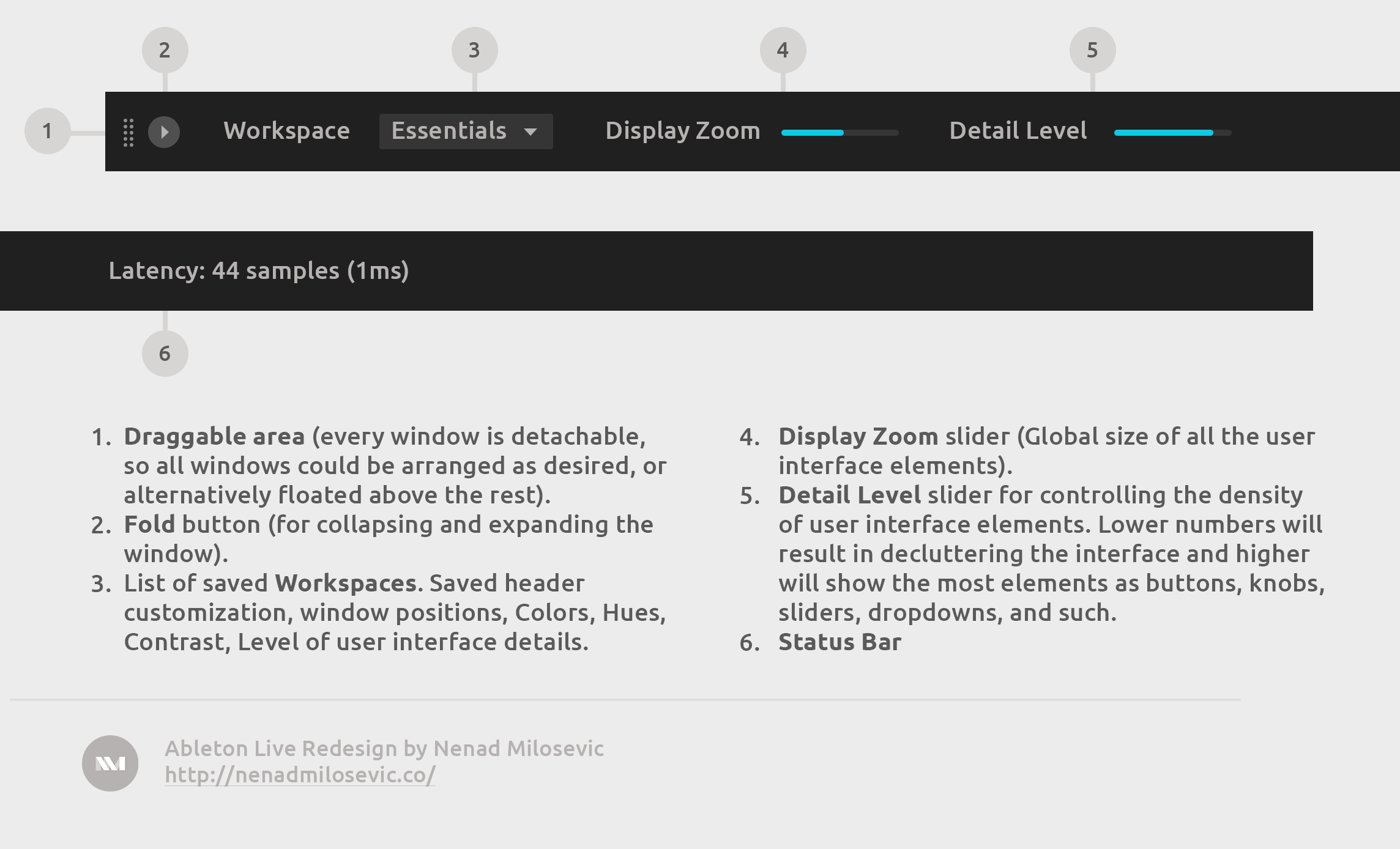
Status Bar with Workspace, Display Zoom, and Detail Level
-
color changes
-
brightness
-
window rearrangements
-
visibility of different sections
-
a level of UI detail
-
display zoom position
-
window sizes
-
shortcuts
-
etc.
Users might save different Workspaces for different usages i.e. composing, mastering, jamming, dj-ing, etc.
As an instrument’s sound can be changed and adapted to different music genres, I imagine DAW should have the same flexibility. Workspaces can help on that front for sure.
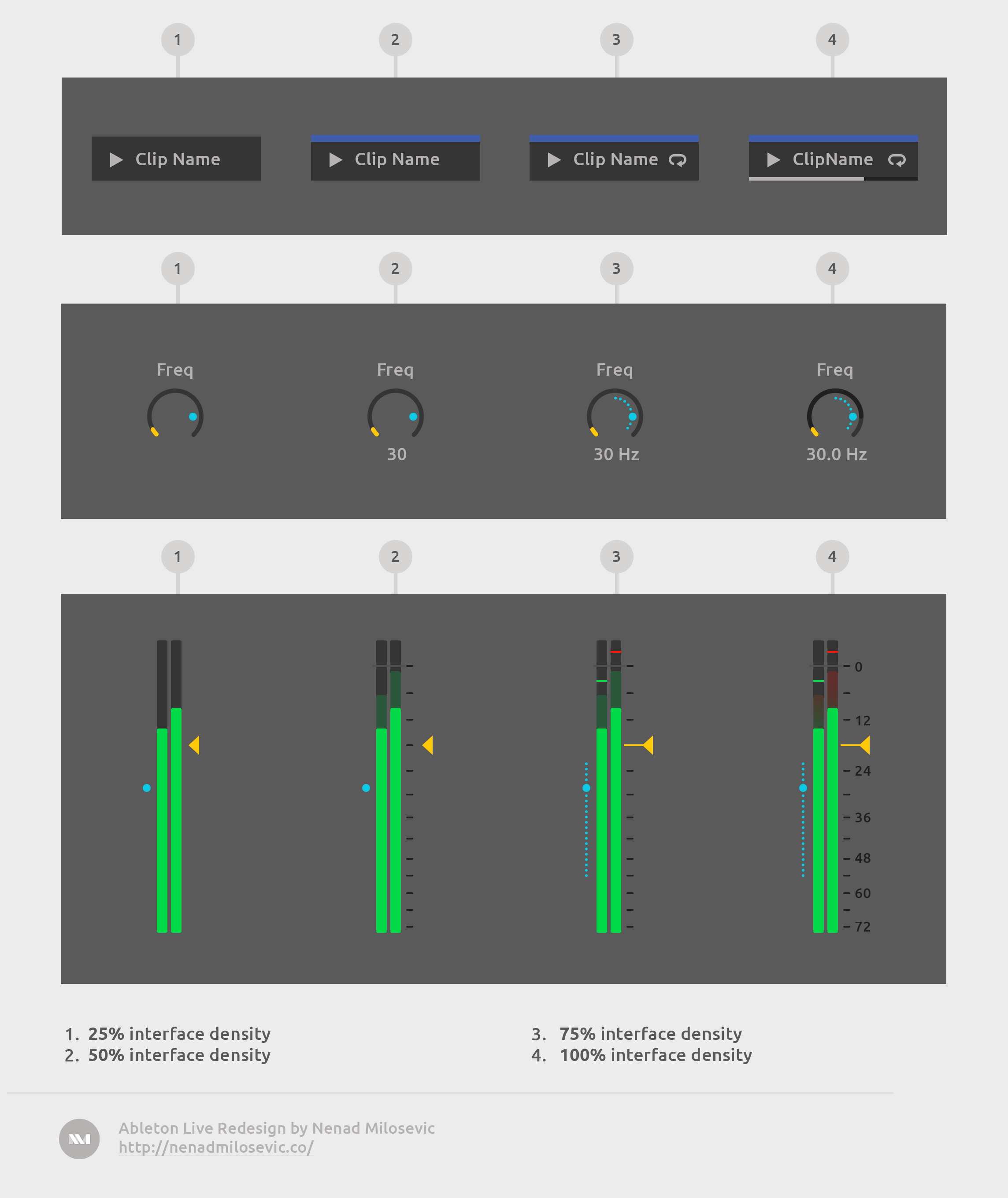
Detail Level slider for interface density control
Browser and Detachable Windows
Browser
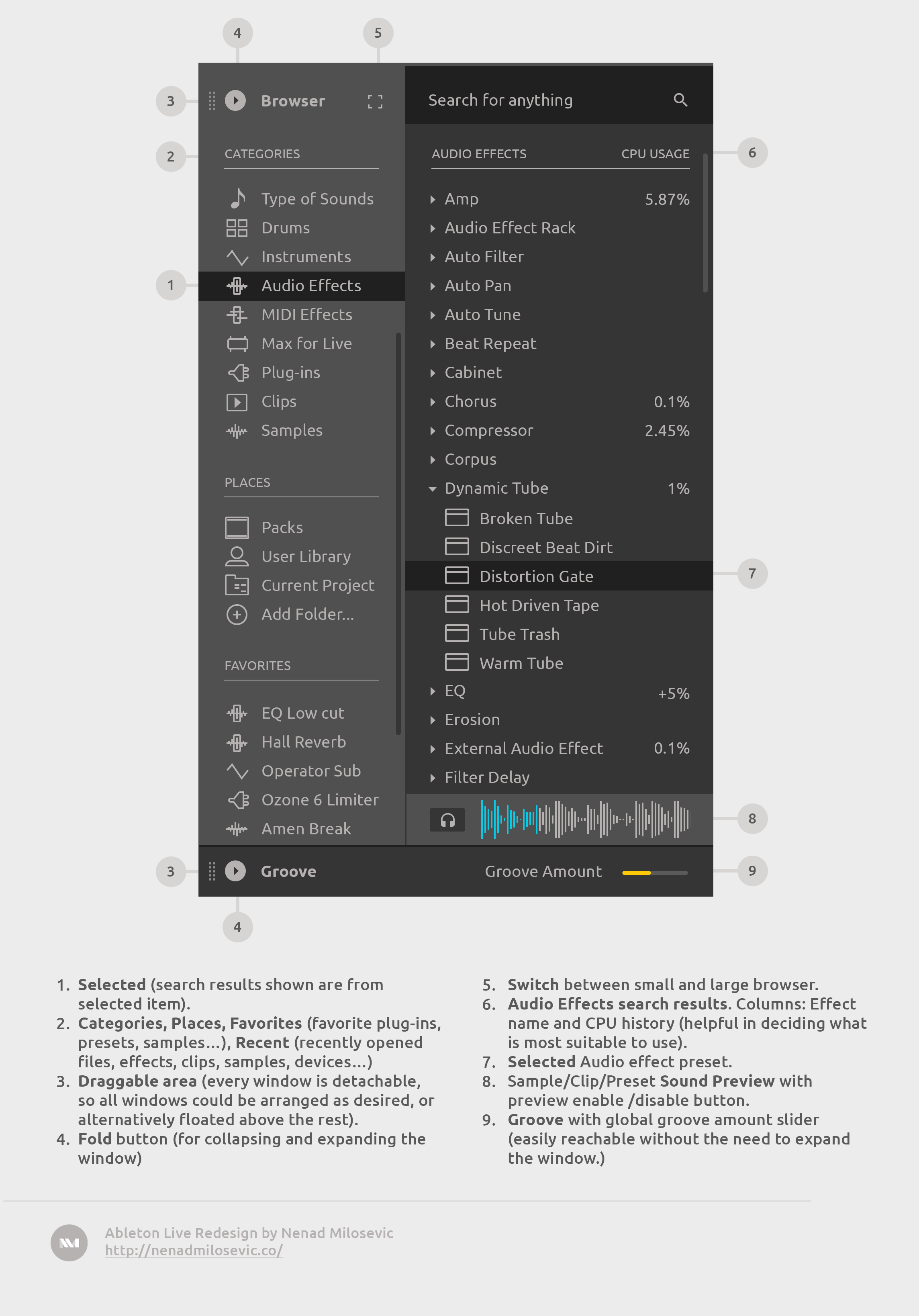
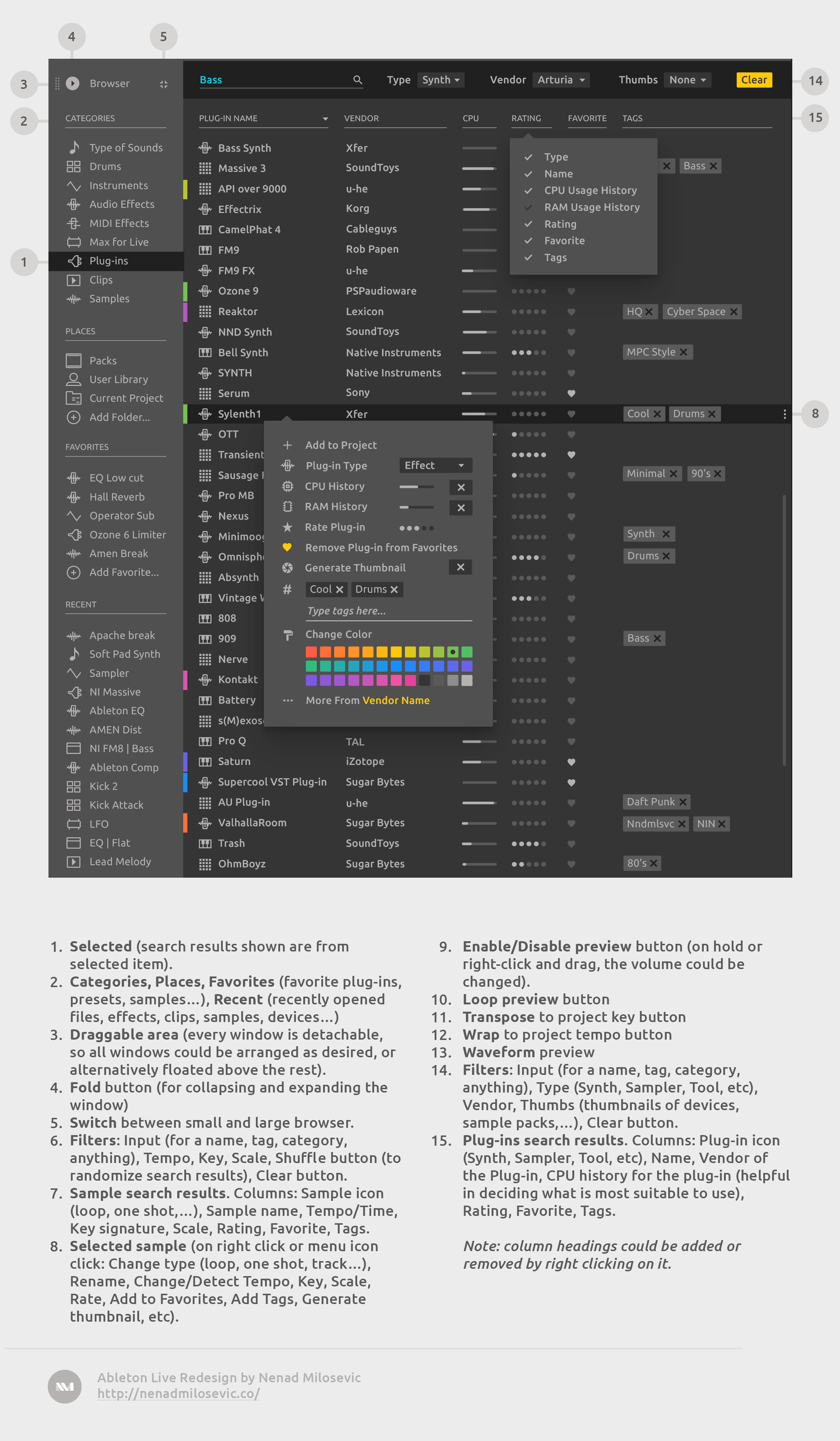
The CPU Usage History shows the percent of how much Ableton device or 3rd party plug-in uses of processor power. It shows the average usage from the time of its install. That info can help in determining the most efficient device or plug-in to use, considering the situation and context. For example, if CPU usage is high and user needs just a subtle effect. By consulting the CPU History the user can make a well-educated choice and choose a low CPU usage device.
Some users have argued that this feature might influence the creative process so there’s an easy option to show or hide its column. It’s done by right-clicking on the table heading, just like in the current version of Live.
Detachable Windows
Some prefer to use the default window arrangement but for some, this feature promises a workflow optimization. Users who don’t want to drag the windows around can rest assured that it won’t happen by accident because all windows are locked by default. For those who like customizing their workspace, an Unlock option in right-click menu is available in every window.
Different arrangements can be saved in Workspaces, as I already mentioned while discussing the Status Bar.
Session View
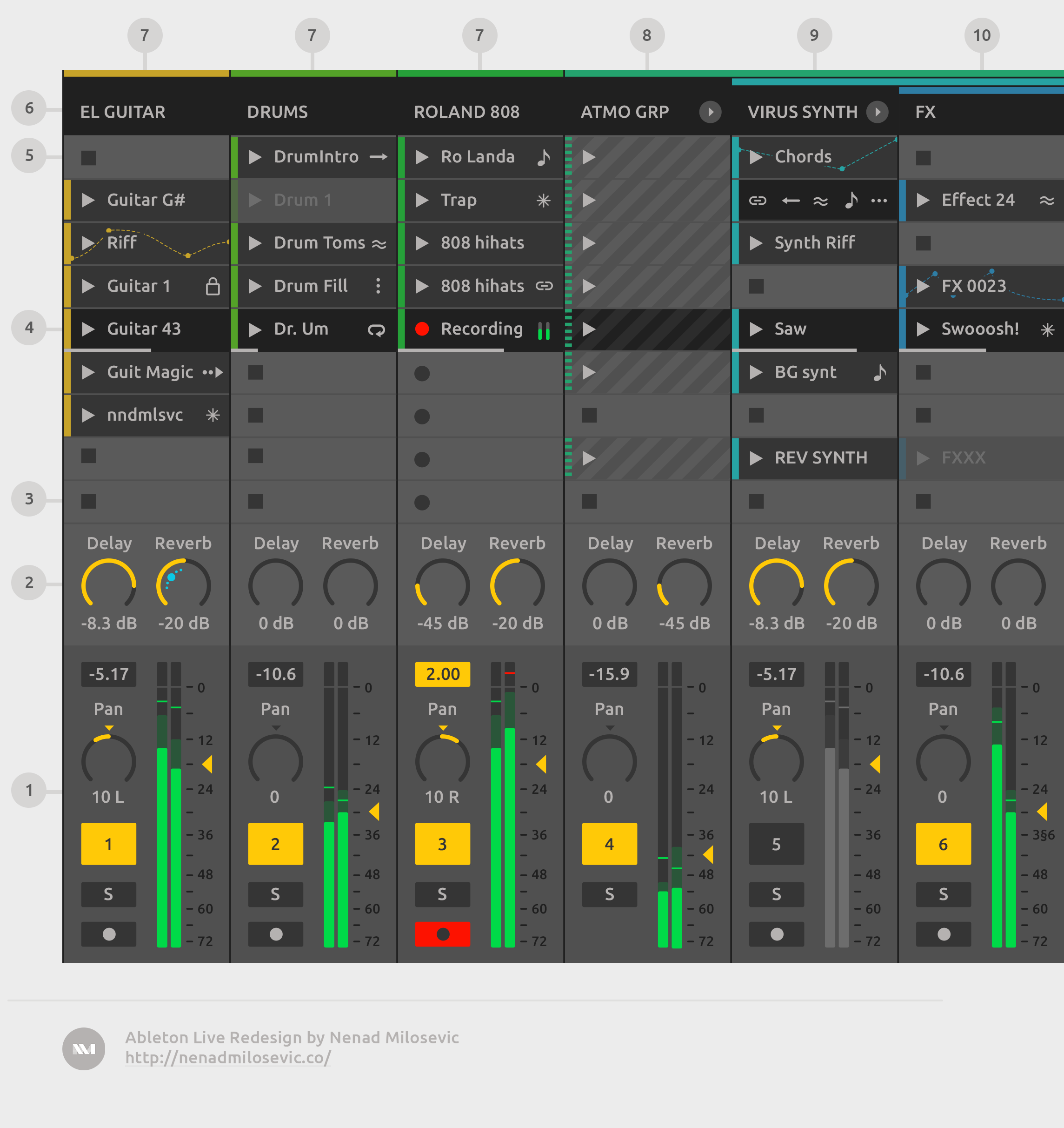
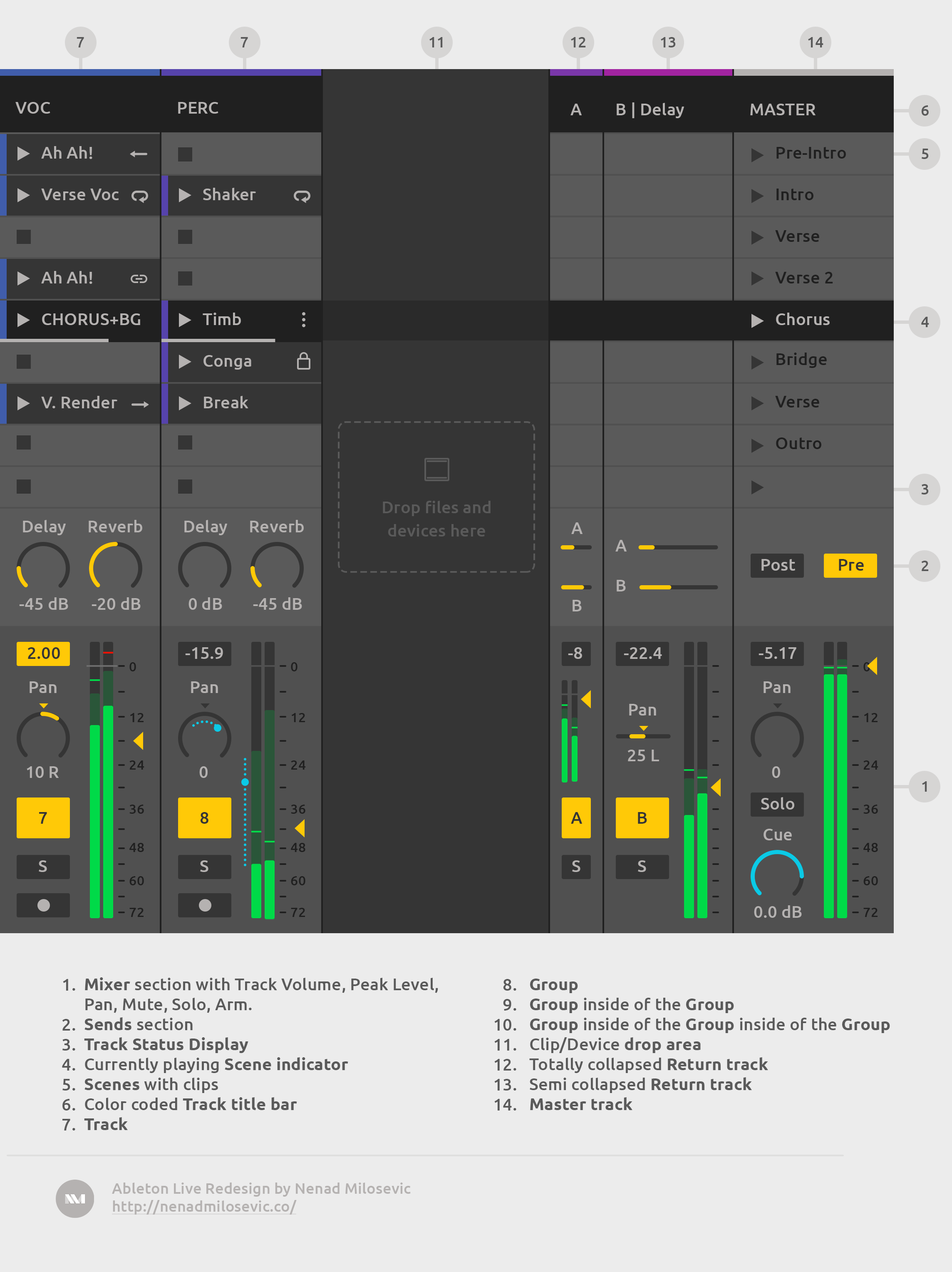
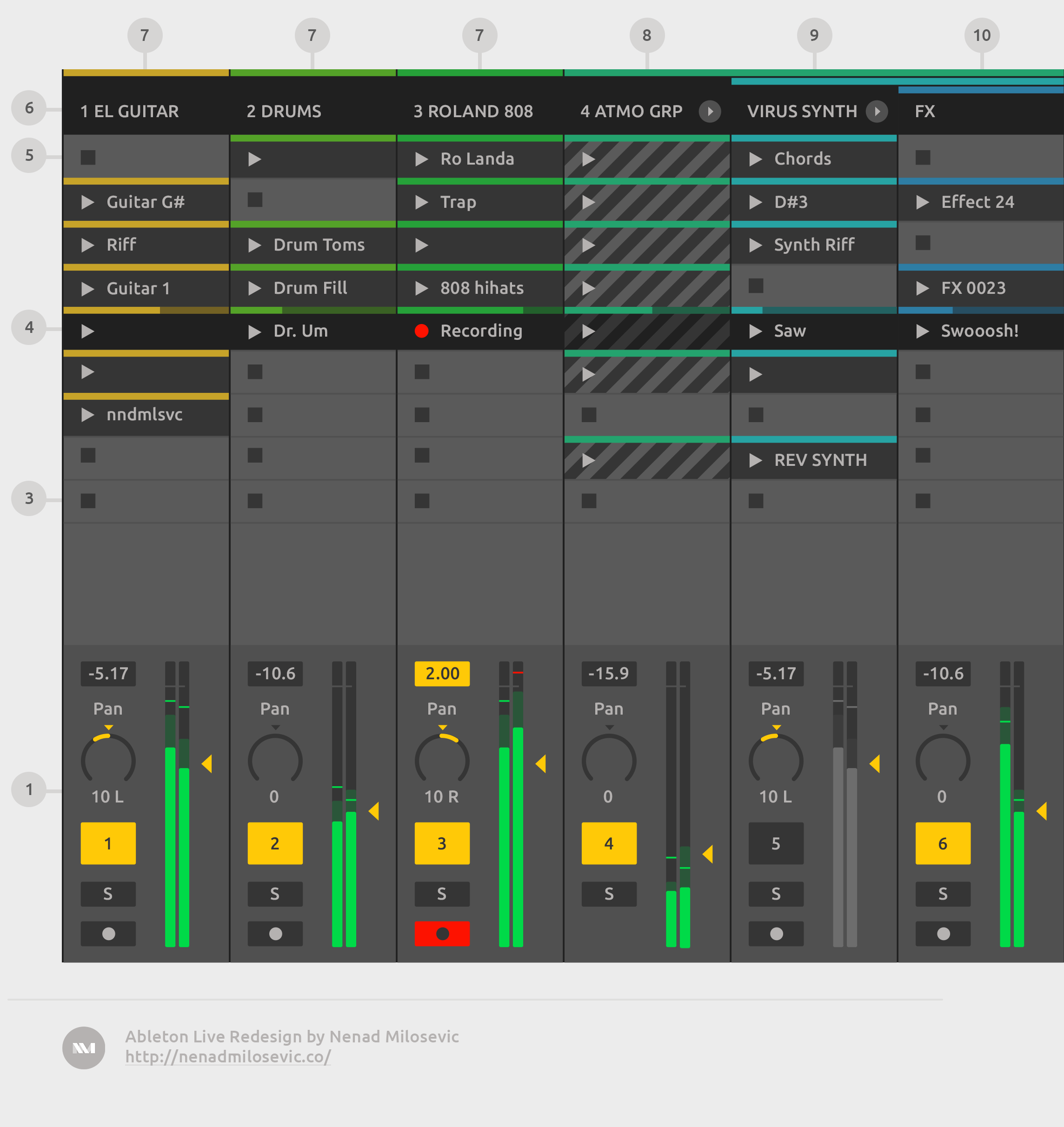
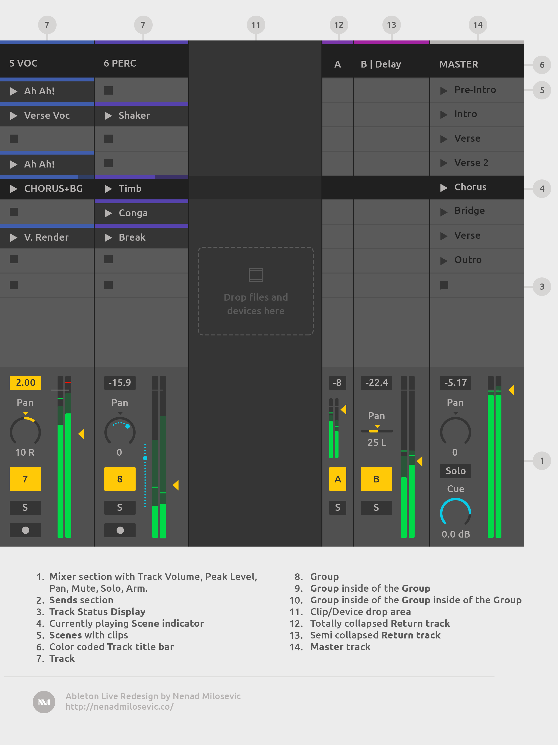
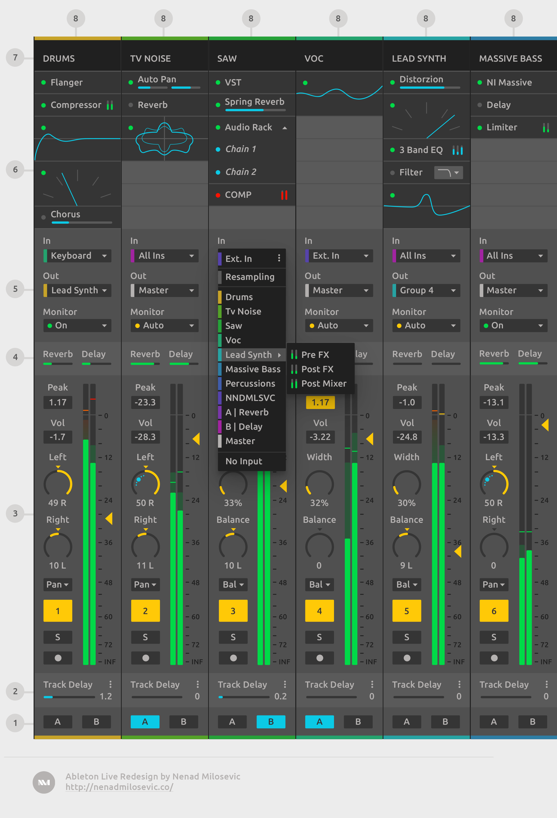
Mixer and Clips with all possible UI elements
There’s the Detail Slider to dial in how much of interface elements one prefer, and there’s an option to show/hide different windows. Also, I showcased here how groups inside groups could work. Blue dots and lines represent automation or modulation.
This is how users feel about this full-on Session View version with all the elements crammed up on one screen.
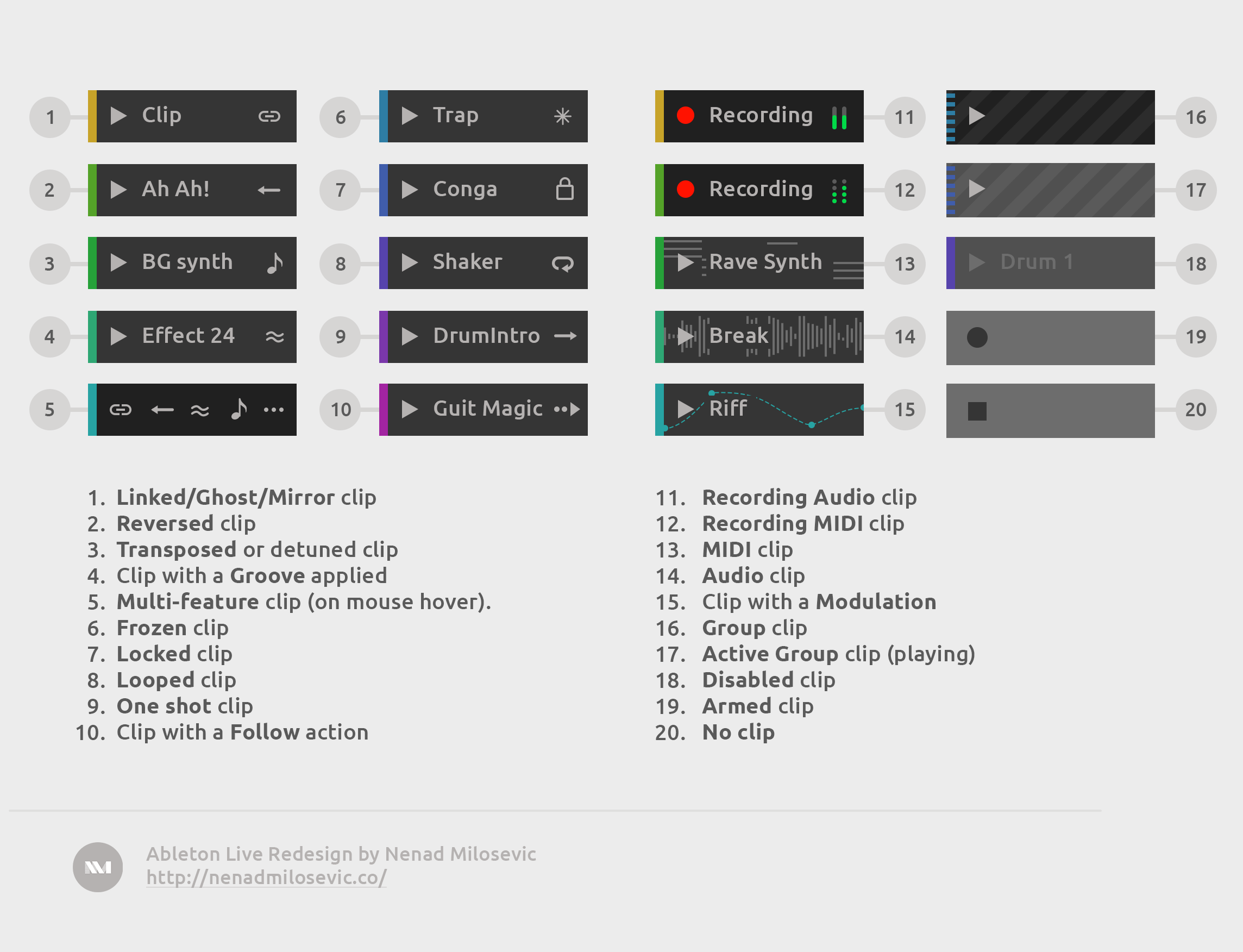
Clip types and states
This image explains all the Clip types and states. Clips with multiple features will have an ellipsis icon (…) which will on mouse hover behave as shown in the image above (5). This is how interviewed users evaluated it (remember: just by looking at it):
Simplified Session View without much of Clip UI elements
Around 40% thought that Session View above looked a bit cluttered, so I revisited it and created this stripped-down version with horizontal color-coding of Clips below. Iterating on feedback baby!
I’m well aware that Ableton has always been about minimalism and simple effective solutions that work, and I respect that. I’m just exploring ideas for different features and trying not to constrain myself too much while keeping an eye on a big picture. Also, I can’t tell what will work without proper testing which is beyond this project.
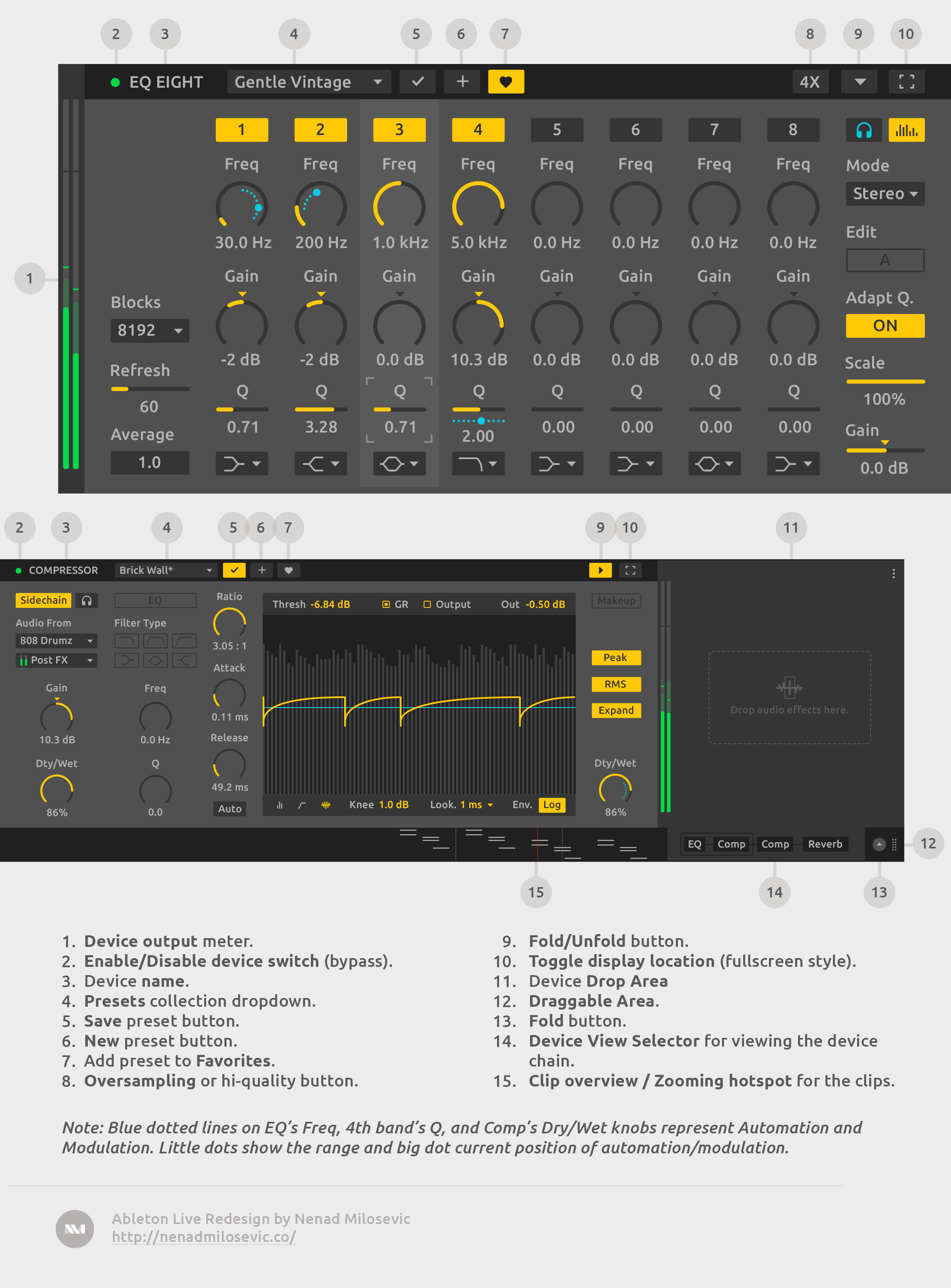
Device Rack
-
oversampling level
-
saturation quality
-
reverb quality
-
delay mode
-
expanding and collapsing the view
-
toggling the display location
-
etc.
I believe it is much clearer and more efficient for the Device View Selector (14) to have text labels rather than small, hard to recognize, devices images.
Browser, History, and Expanded Mixer
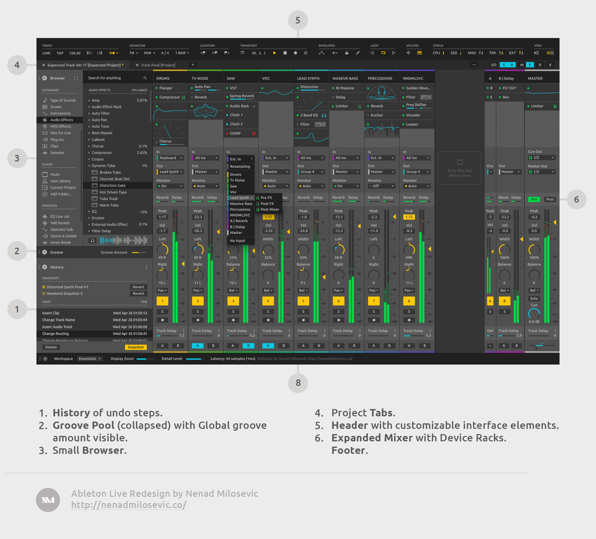
The Expanded Mixer is another View. So, you can toggle between Session View, Arrangement View, and Expanded Mixer View using Tab button. Or perhaps, by pressing the Show/Hide Expanded Mixer Section button next to the Show/Hide Mixer Section button. Located within View Options section (9).
I’m aware that this is not the best solution ever because I’m kinda mixing up the Views and Sections. I strongly believe that it could be elegantly solved with slightly more time and resources.
Expanded Mixer and History
Expanded Mixer with Device Slots and I/O section
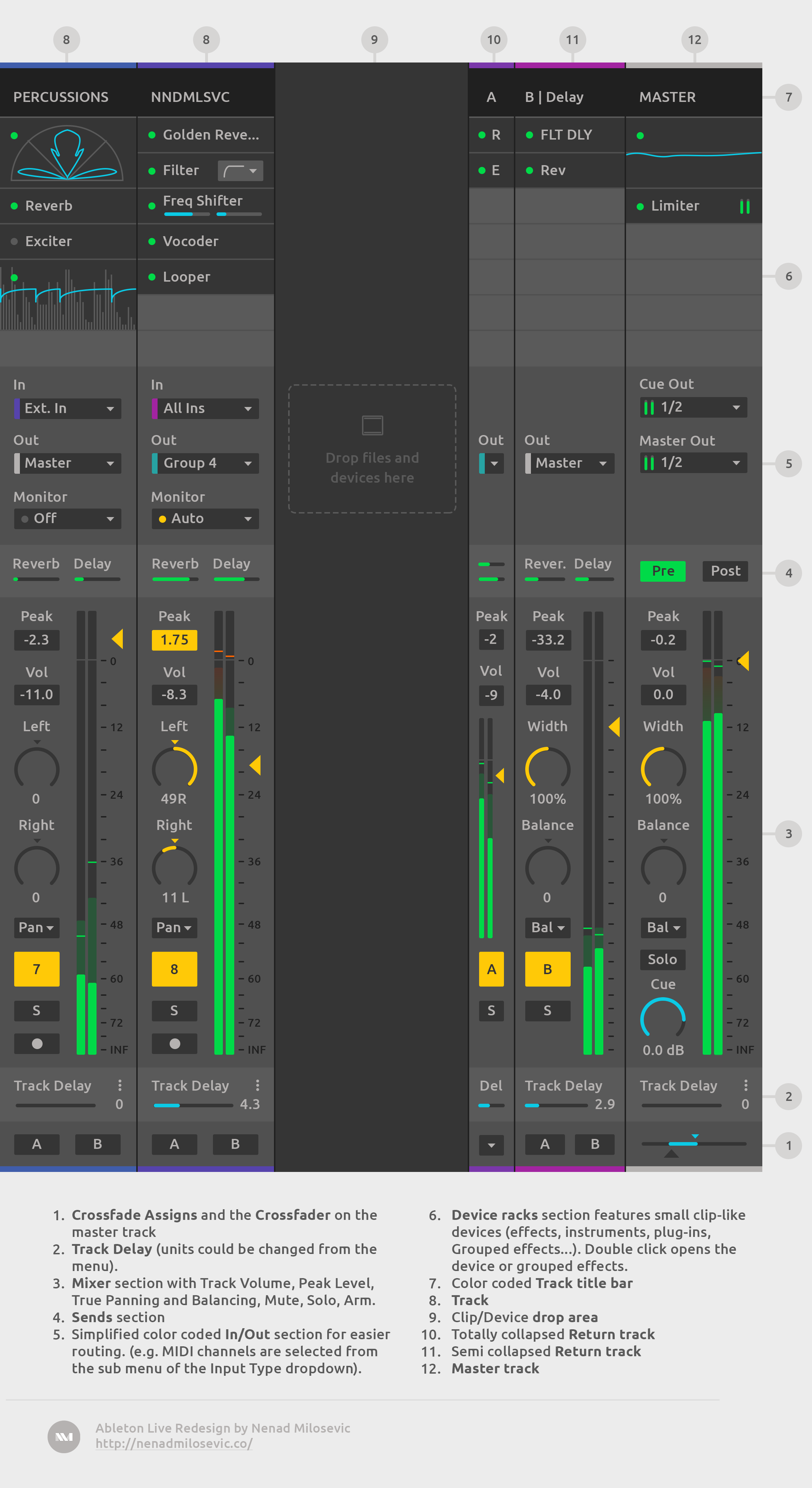
Instead of Clips, the Extended Mixer View has Device Slots layered for each track vertically, top to bottom. Every Device Slot has different device’s parameters assigned. They can be added or removed by right-clicking on a specific device parameter and selecting Assign to or Remove from the Device Slot.
Because Expanded Mixer is taking a full-screen height, I also added track colors at the bottom of the channels for easier navigation. Stereo controls are pimped up with Panning, Balancing, and Stereo With (from Mono to Out of Phase). Additionally, It’s possible to choose between Panning and Balancing per channel.
I/O section is simplified to just three elements instead of four dropdowns and three buttons. Minimization is accomplished by having the first level visible and other sublevels shown on click.
I can’t stress this enough: this is just what users think! It’s just validation that these ideas have potential. Nothing more, nothing less. I’m not saying Ableton should do/implement all of this, I’m saying maybe this is worth testing. I thought this was very clear from the start (because common sense + I wrote at the beginning exactly that) but considering the feedback I got—boy was I wrong!
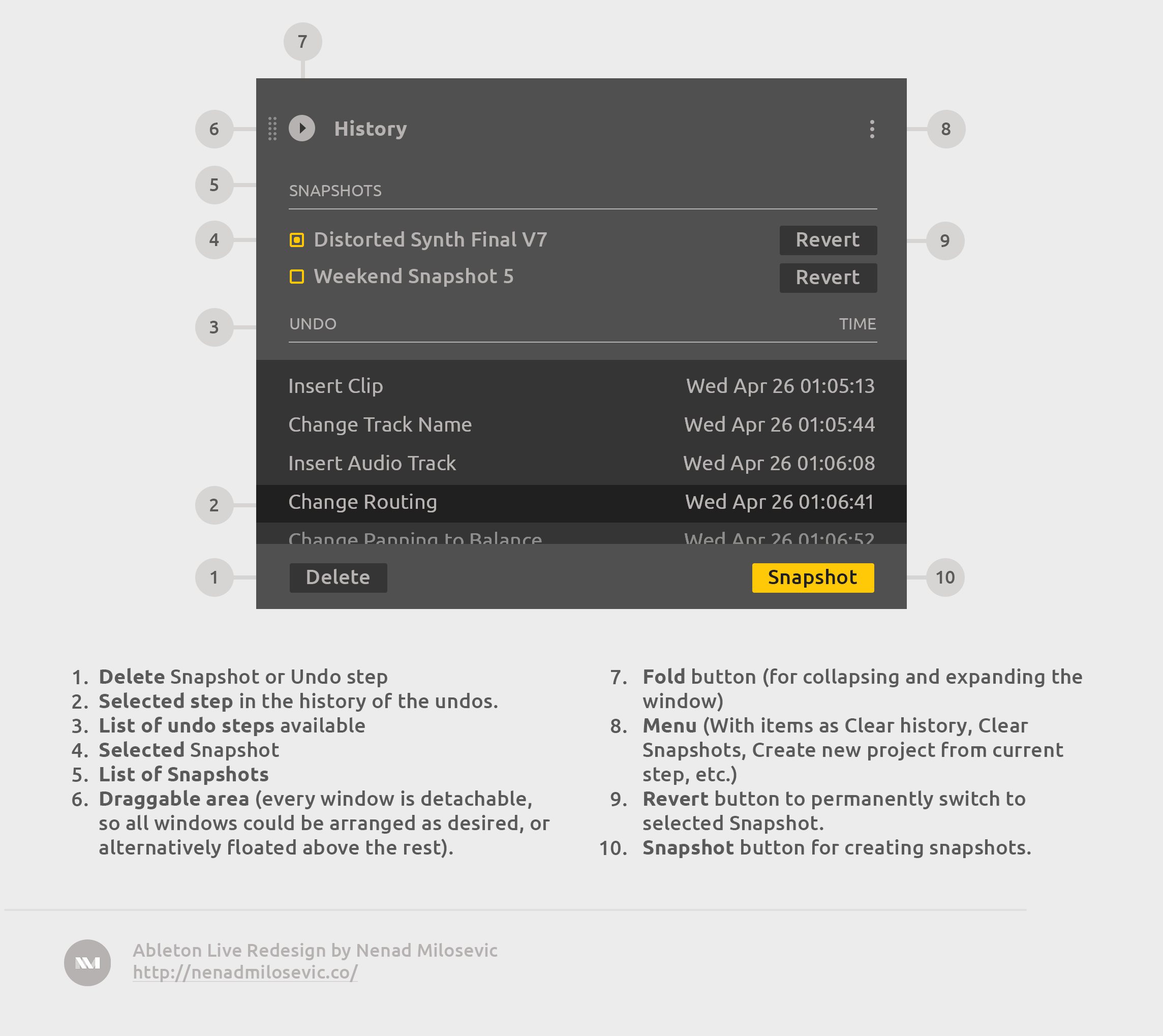
History of undo steps with Snapshots
Visual representation of undo steps with a possibility to save snapshots, get back to them later, and to branch out from a project. Many of the interviewed users were thrilled with this feature but concerned that it’s not possible to develop. So, I would like to reassure them by mentioning that very similar feature called History Panel exists in Adobe Photoshop from 1998’s version 5.0.
Expanded Browser and Expanded Mixer
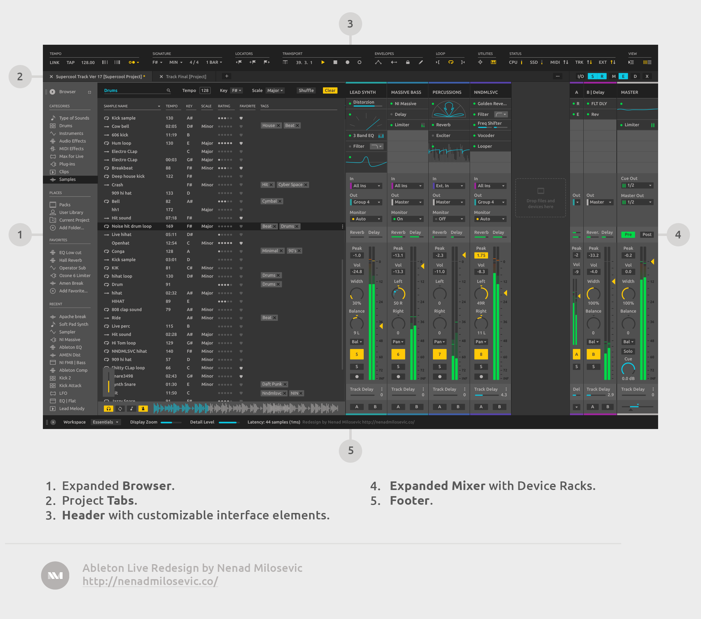
Expanded Browser
Sketches of browser exploration and competition analysis
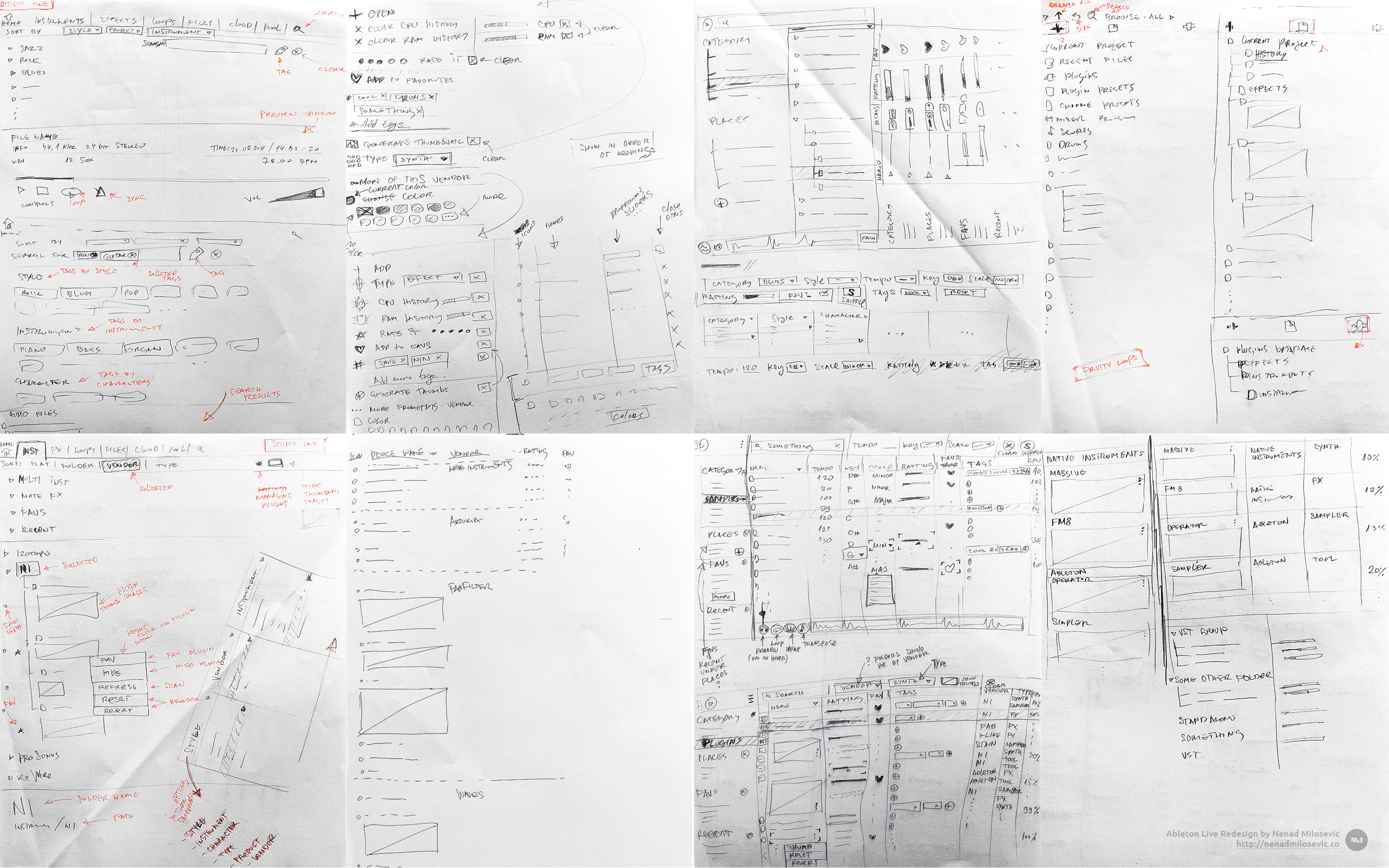
Sketches of Studio One and Fruity Loops browsers, and sketches of my Ableton Live expanded browser redesign.
I drew other DAW’s browsers, media bays, libraries, etc. to see what works and what doesn’t. By combining that and my own ideas with suggestions from interviewed users, I came up with this Expanded Browser.
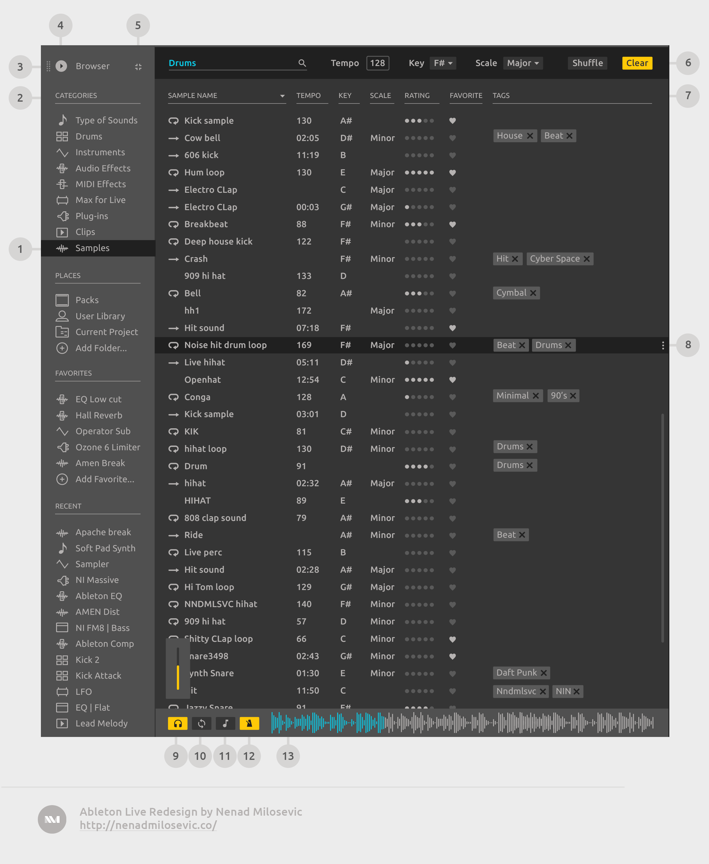
Sample and Plug-ins search results within Expanded Browser
Expanded Browser should enable easier and more efficient organization of samples, presets, devices, and plug-ins. The Favorites section on the left side is for the favorite items used frequently. The Recent section is a list of all recently used items of any type, tags, folders, plug-ins, samples, presets…
Sample/Plug-in Type column helps in distinguishing and sorting by the type of search result. Tempo, Key, and Scale are very helpful in searching for a sample or perfect loop. For a useful rating system, I suppose item rating should be set by the user and not by the application based on the frequency of use (this is how Live currently do it). Besides rating and favorites, there’s tagging and color-coding tools for the organization as well. I’ve already talked about CPU history earlier.
Sample Preview has an on/off switch, volume slider, loop, and options to wrap and transpose sample preview to the project’s tempo/key/scale. Project Key and Scale can be set from the Signature header menu group (7, 8).
Wrap up
I’m very, very, happy how all of this turned out at the end, having in mind how little of resources I had (pretty much none). I’d never imagined I’d get this amount of support and feedback from the Ableton Live community. This is what they liked the most:
It was very clear from my first research that Modern look was something very important to Live’s users (ranked 5th on the wishlist). So, I asked in the second survey how much they thought of my designs as a ‘modern’ update:
That’s it! I see this as an idea, beginning, and inspiration. Not a destination but a direction where Live might go in the future. I hope you’ve enjoyed the journey and liked this enough to consider me as a potential new colleague! If you have, please don’t hesitate to contact me.
Best,
Nenad.
P.S. My Ableton Live redesign was featured on MusicRadar, sidebar.io, Ask.Audio, T-Mobile Electronic Beats, SonicState Talk, CDM magazine, Gearnews, Block.fm (Japanese), Gearnews (German), Digilog (Chinese), Startit (Serbian), MixMag (Croatian), Kontroleryzm (Polish), MusicMag (Russian), DynaDrums, and uninvitedredesigns.com… and discussed on Hacker News, ADSR Sounds Facebook, MusicRadar Facebook, Computer Music Facebook, Point Blank Music School Facebook, Production Music Live Facebook, Ableton Live Facebook, Ableton subreddit, edmproduction subreddit, Audiosex thread, CDM Facebook, Ask.Audio Facebook, T-Mobile Electronic Beats Facebook, Gearnews Facebook and Random Tweets about final redesigns.
Edit 1
Unfortunately, at the end, I didn’t get the job nor an interview where I could have commented on or explained my design decisions. However, after I got the email saying that they don’t want to interview me, I did get a chance to talk with their head of design, Ed Macovaz. Ed and I discussed my unsolicited redesign and he gave me his and team’s feedback as well as some useful insights on how to improve as a designer.
Let me finish this by saying: Sometimes you win, sometimes you learn.
Edit 2
You can now freely download all the project files (PSDs, PSBs, and Sketches) I’ve been working on for the past few months from my GitHub Repository or directly from my website. Giving back to the community! 🖖
BTW, if you need UX or UI design or searching for product designer, hit me up. You can take a look around my portfolio where you can find a lot of VST plugin designs and other audio software interfaces. If you have any questions don’t hesistate to contact me.


